A map of HDB distribution that can do filtering based on types, price and lease year
A website about map projection
A website about the health resource accessibility
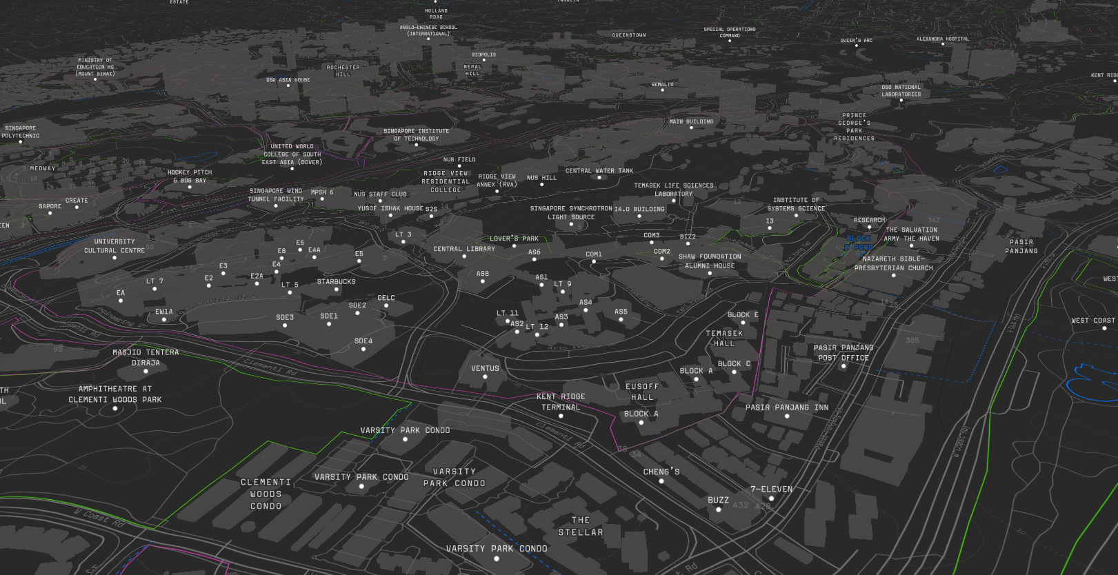
3D maps showing the urban functional zones and buildings.
SUTD campus Project app webpage
a kepler.gl map for showing the poi distribution
Kampung Admiralty Project app webpage
Are we safe now? The incidence trends of COVID-19 in May 2020.
After about 14 weeks (100 days) since the first Covid-19 lockdown at Wuhan City, the number of confirmed cases surpassed 3,000,000 globally. The article aims to present some short and simple observations on the Covid-19.
EpiRank disease diffusion risk distribution
The maps in the list show the COVID-19 development through space and time.
The map shows the vertical displacement activity extracted from the NSE dataset.
A series of heat map showing the density of the students in week 4 Tuesday to Thursday (3days) samples.
About Singapore Demography
A map of HDB distribution
