In Figure 1, on the left is the mapped flow of people between towns in Singapore, while the right shows the key flow structure---the information---that was analyzed from the data in the left.
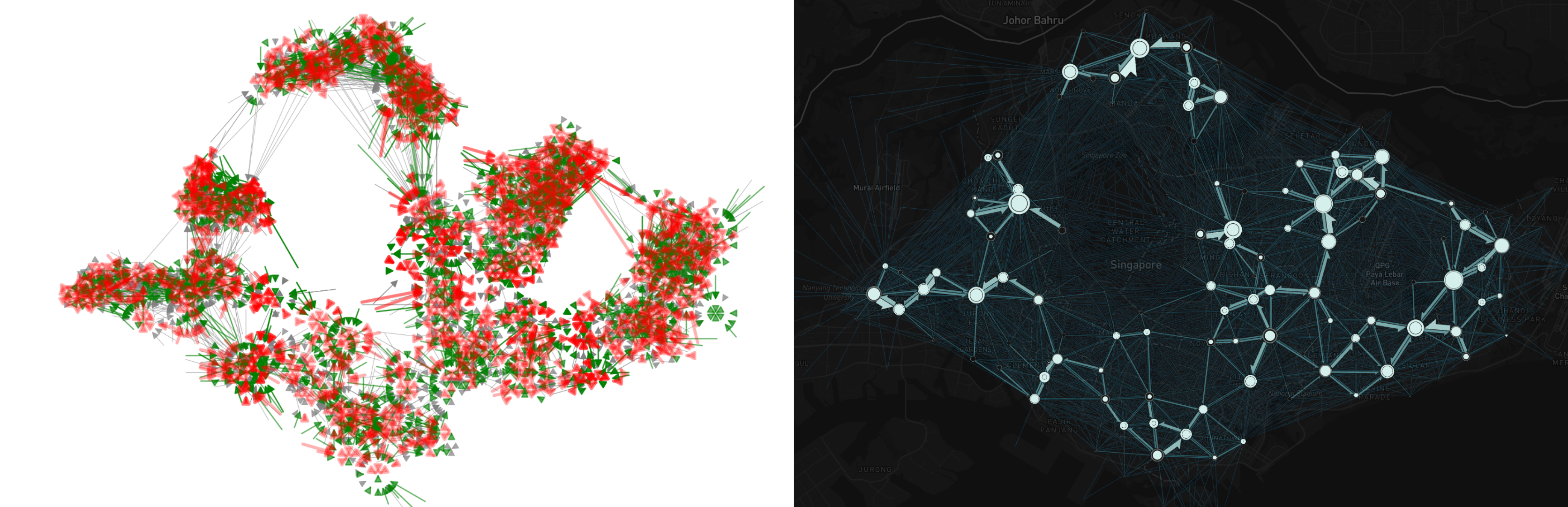
Figure 1:Data vs. Information
From Data to Information, then Insights
Data: Raw facts, figures, or observations collected and recorded] in various forms, such as text, numbers, or images. Data is the basic building block for understanding and analyzing phenomena or trends.
Information: Organized, structured, and processed data that provides context and meaning, making it useful and relevant to specific users or situations. Information helps answer questions and guide decision-making.
Insights: Deep, meaningful conclusions and understanding derived from analyzing and interpreting information. Insights uncover patterns, trends, or cause-and-effect relationships, enabling informed decisions and new perspectives.
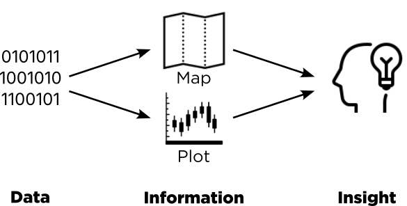
Figure 2:Data, Information, Insights.
Geovisualisation is a series of explorations and analyses, that includes using various techniques and methods, e.g., thematic mapping, exploratory spatial data analysis, to uncover the underlying patterns, to get better understanding of geographical phenomena.
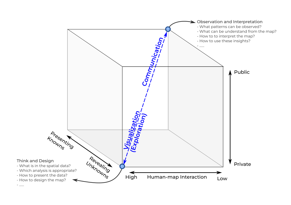
Figure 3:MacEachren’s cartographic cube.
The Key Steps of Data Visualisation: OTAS
Observe
Think
Assess
Show
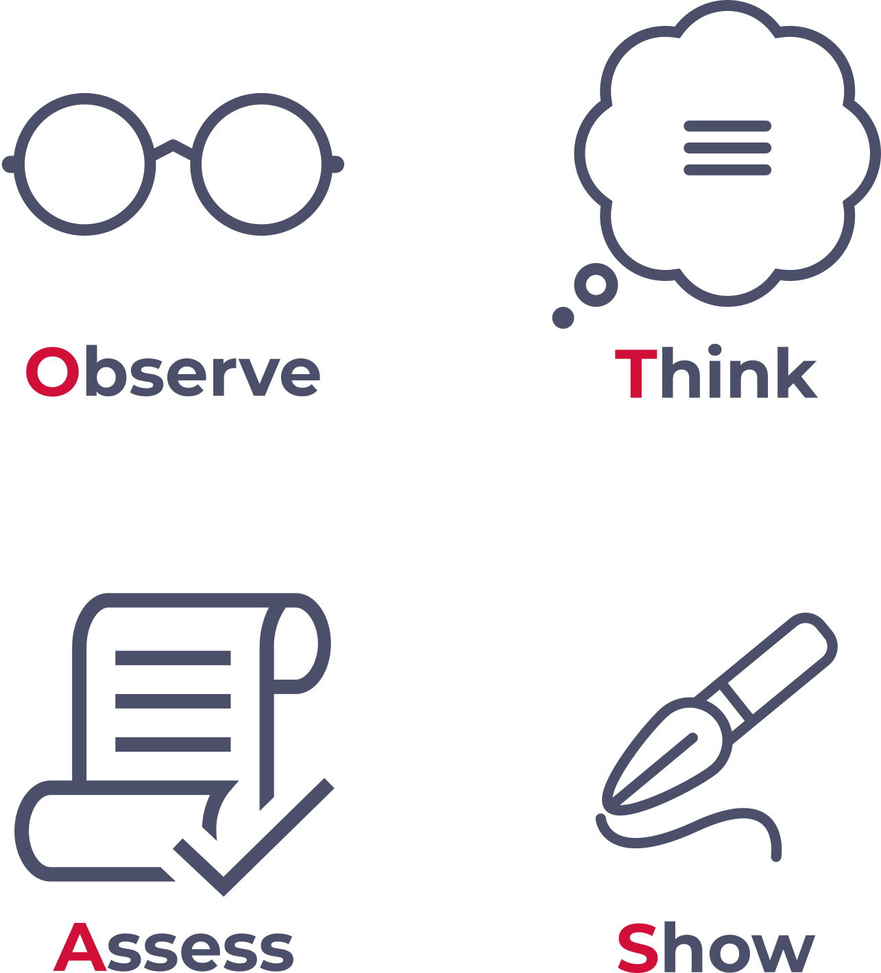
Figure 4:OTAS.
Observe
What can be SEEN?
Ensure you understand the metadata.
Look into the data.
Get your hand dirty: Create relevant plots or maps using the data.
whatever plots/maps that you can think of, sky is the limit
Look at those plots and maps...
Divergent thinking, brainstorming
Think
What are the CAUSES?
How does it look?
Are there any familiar or expected patterns? (that you may have seen somewhere before)
Is there anything looks unusual and strange? (something that really stands out)
Is there anything wrong?
Are there any unexpected patterns? (something beyond your expectation)
unexpected patterns are usually the interesting one, if they are real
counter-intuitive
What could be the possible reasons behind these patterns?
Expanding and synthesizing from the brainstorming step
Assess
How to VERIFY them?
Review and (re)evaluate your initial ideas or thoughts, even if they seem immature, unconventional, or funny.
Test your hypotheses or thoughts to ensure their validity.
Double-check for any possible (stupid) mistakes made during
data processing,
calculation,
unit transformation,
map projection, or
visualization.
Literature review for confirmation/contrasting the findings.
Convergent thinking, rigourously evaluating every idea
Show
How to VISUALISE them?
(Re)Drawing the plots & maps
Think about the layouts
potrait, landscape
combining multiple subplots
sequences
colours
text font family, size, and positions
Show it to people
Communicate based on it
Getting feedbacks
OTAS Flow
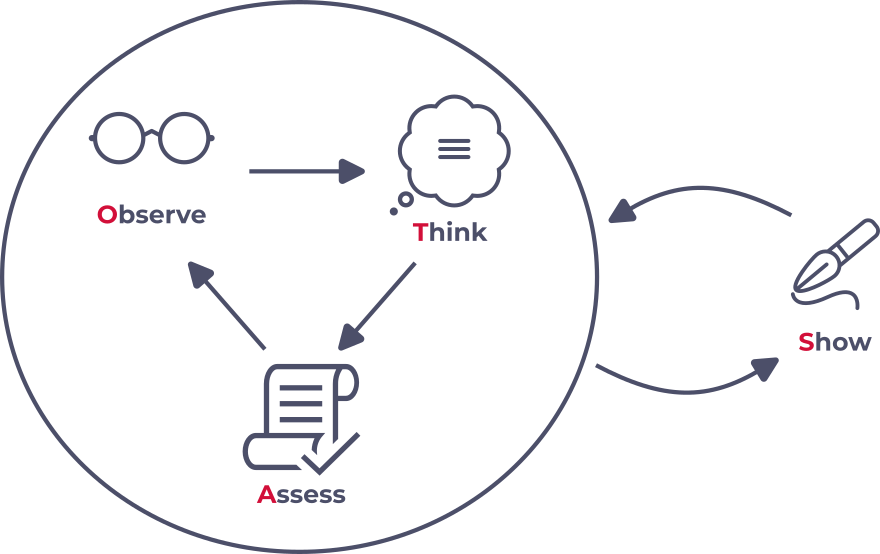
Figure 5:OTAS workflow.
Summary
There is no strict rules for doing data visualisation
The four OTAS steps are just a quick guideline for the “visual thinking process”
Observe: divergent thinking & brainstorming
Think: extending & synthesing
Assess: convergent thinking & double checking
Show: presentation
Some people skip the Think and Assess steps and jump from drawing initial plots/maps step to the last showing/communicating step.
Their results could be bias, not comprehensively capture the thoughts