Visualization?
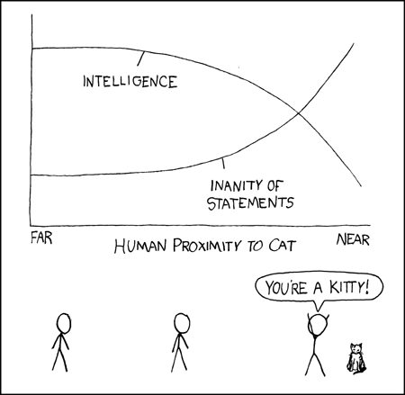
The comic shows a visualization of the relationship between human proximity to cat and the intelligence of the person.
Visualization is the process of representing data or information in a graphical or pictorial form to communicate an idea, concept, or pattern more effectively.
Why visualization?
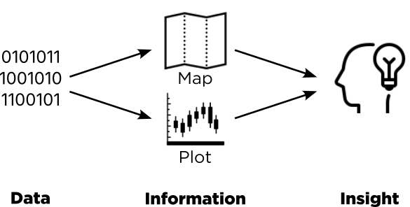
Data, Information, Insights.
Geovisualization is a series of explorations and analyses, that includes using various techniques and methods, e.g., thematic mapping, exploratory spatial data analysis, to uncover the underlying patterns, to get better understanding of geographical phenomena.
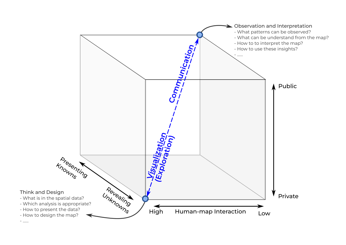
MacEachren’s cartographic cube.
What is a good visualisation
A good data visualization effectively communicates complex information in a clear, concise, and engaging manner, allowing the audience to quickly understand the data’s key insights and messages.
Clear Purpose: A well-defined purpose or goal helps guide the creation of the visualization, ensuring that it addresses relevant questions and objectives.
Appropriate Visual Encoding: The choice of visual elements (e.g., color, size, position) should accurately represent the data and facilitate easy comparison, pattern identification, and understanding.
Clarity and Simplicity: A good visualization should be easy to comprehend, avoiding unnecessary complexity and clutter. Clear labeling, appropriate use of scale, and logical organization contribute to overall clarity.
Meaningful Context: Providing context through labels, titles, captions, and reference points helps the audience interpret the data more accurately and effectively.
Attention to Detail: A well-crafted visualization pays attention to details such as color palettes, fonts, and visual hierarchy, creating an aesthetically pleasing and professional-looking end product.
Accessibility: Ensuring that visualizations are accessible to all readers, including those with color vision deficiency or other visual impairments, is an essential aspect of good data visualization.
Interactivity and Responsiveness: Interactive visualizations allow users to explore and customize the data presentation, enhancing engagement and understanding.
Accuracy: A good visualization accurately represents the underlying data, avoiding distortion or misrepresentation.
Get some inspiration here for what is good visualisation

Screenshot of Information is Beautiful
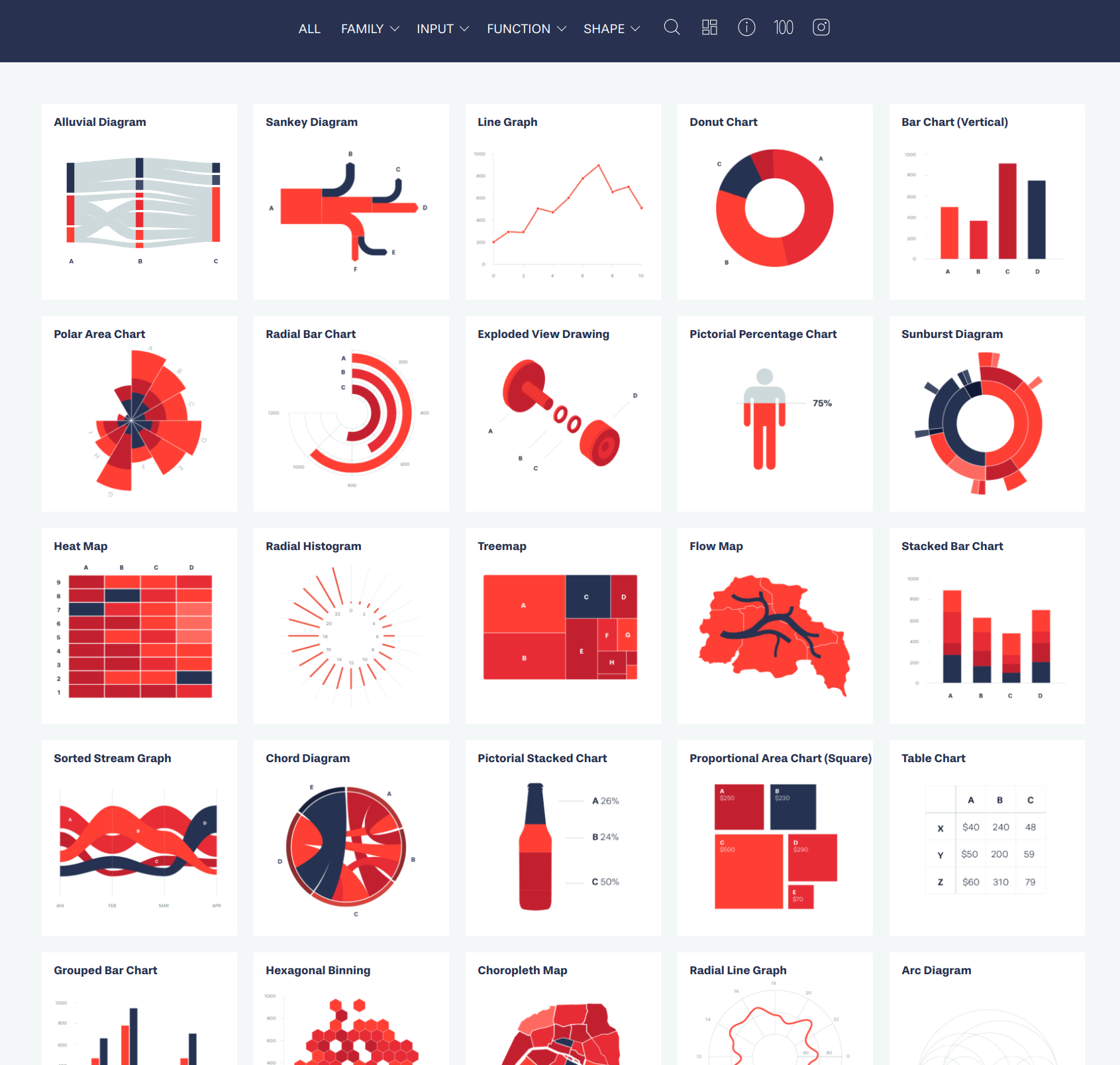
Screenshot of Data Viz Project
Statistics for better visualisation
Statistical tools play a crucial role in creating meaningful geospatial data visualizations and forming useful insights.
Descriptive Statistics: Basic descriptive statistics like mean, median, standard deviation and frequency distribution can help summarize and describe geospatial data.
Data Classification: Methods for classifying geospatial data, such as equal interval, quantile, natural breaks, and geometrical intervals help organize and group data for effective visualization and analysis.
Spatial Autocorrelation: Spatial autocorrelation techniques could measure the similarity between values in a given spatial dataset. This can help identify spatial clusters or outliers in the data.
Spatial Heterogeneity: Heterogeneity refers to the variability of a variable across a study area. Spatial heterogeneity can be analyzed using techniques like geographically weighted regression (GWR) or spatial error models to better understand regional variations and factors influencing local patterns.
Spatial Dependence: Spatial dependence occurs when the values of a variable at one location depend on the values of the variables at nearby locations. Analyzing spatial dependence can help model spatial relationships and predict outcomes more accurately.
Elements for bad visualisation
Clutter and Complexity: Excessive use of colors, fonts, labels, or visual elements can make a visualization difficult to interpret and detract from its main message.
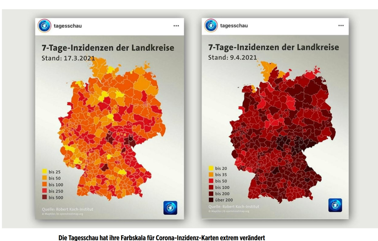
Misleading Scales or Axes: Manipulating or misrepresenting scales or axes can distort the data and lead to inaccurate conclusions.
Poor Color Choices: Using color palettes with low contrast or inappropriate color associations can make it difficult for viewers to distinguish between different data points or categories.
Confusing Data Encoding: Inconsistent encoding of data (e.g., using different symbols or sizes for the same value) can make it challenging for the audience to compare and understand the data.
Unnecessary 3D Effects: Adding 3D effects without a specific purpose can add unnecessary complexity and make it harder to interpret the visualization accurately.
Lack of Context: Omitting important contextual information, such as units, labels, or reference points, can hinder the audience’s ability to understand and interpret the data accurately.
Unnecessary Visual Elements: Including irrelevant visual elements or “chart junk” can distract from the main message and clutter the visualization.
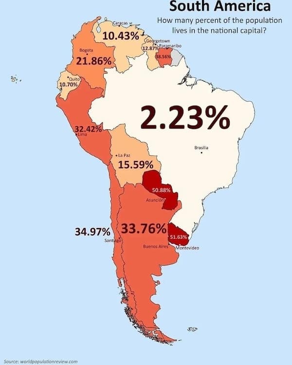
Inaccurate Representation of Data: Using the wrong visualization type for the data type or purpose can lead to misinterpretation and misunderstanding.
Example of bad visualisation
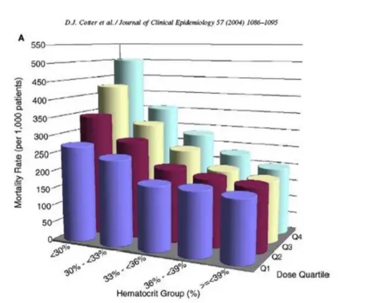
Unnecessary 3D view.
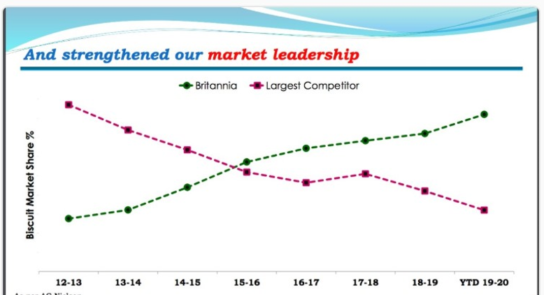
A bar chart could be clearer.
Line plot used to show discrete data (not continuous).
Confusing composition --- what is the main message?
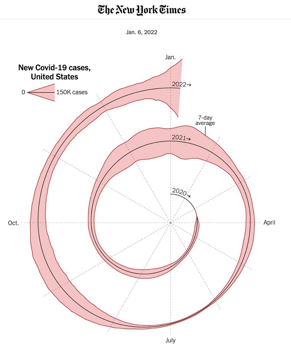
Unnecessary spiral effect --- what is the main message?
Negative values going up and/or down?
Color palette choice & type of chart (bar? or just table).
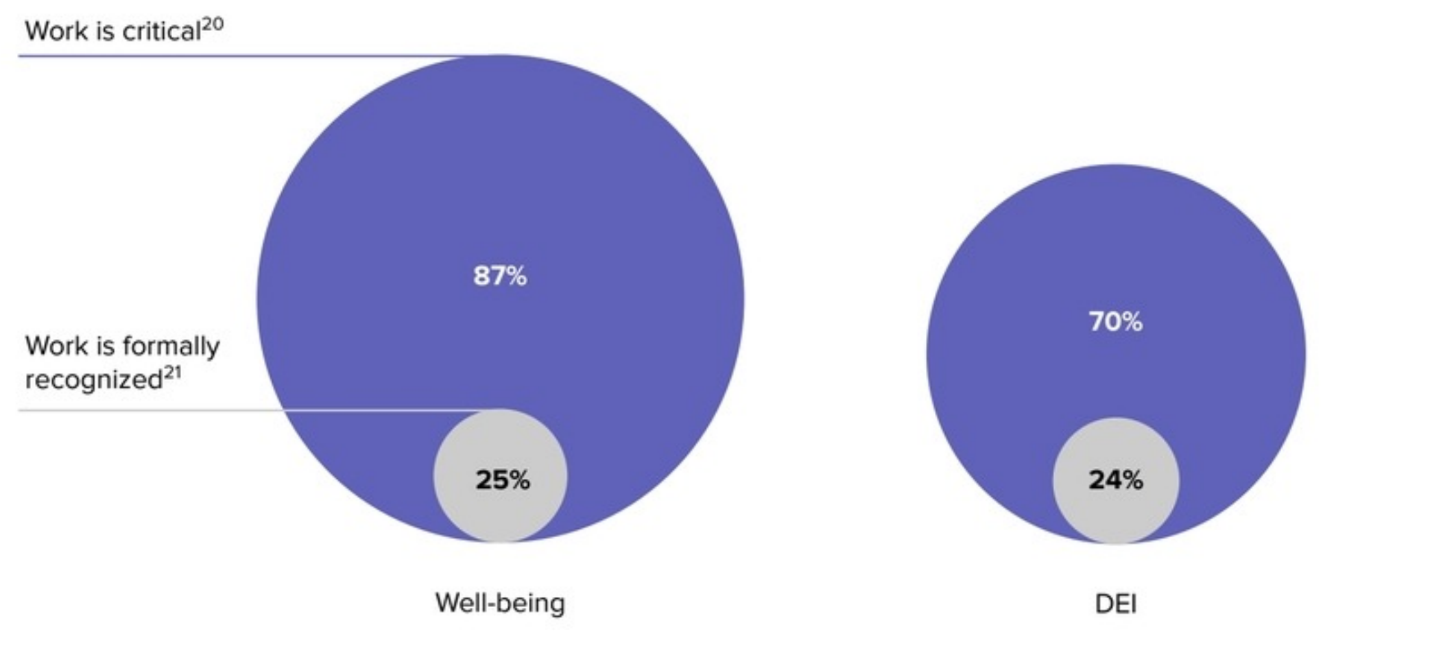
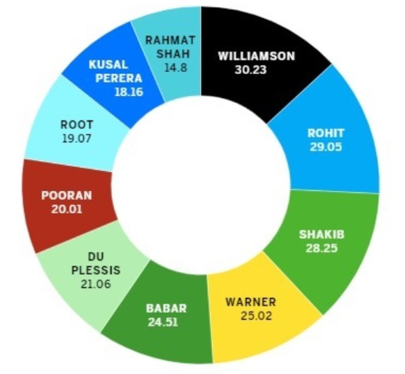
Generated based on the relative diameters of their circles, not relative areas. It’s subtle but still misleading.
Inconsistent categories and colors.
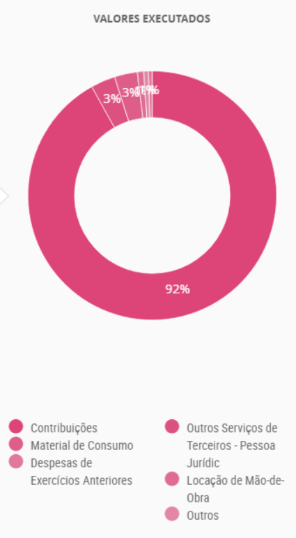
Distracting labels (numbers).

Confusing area effect.
How about these?
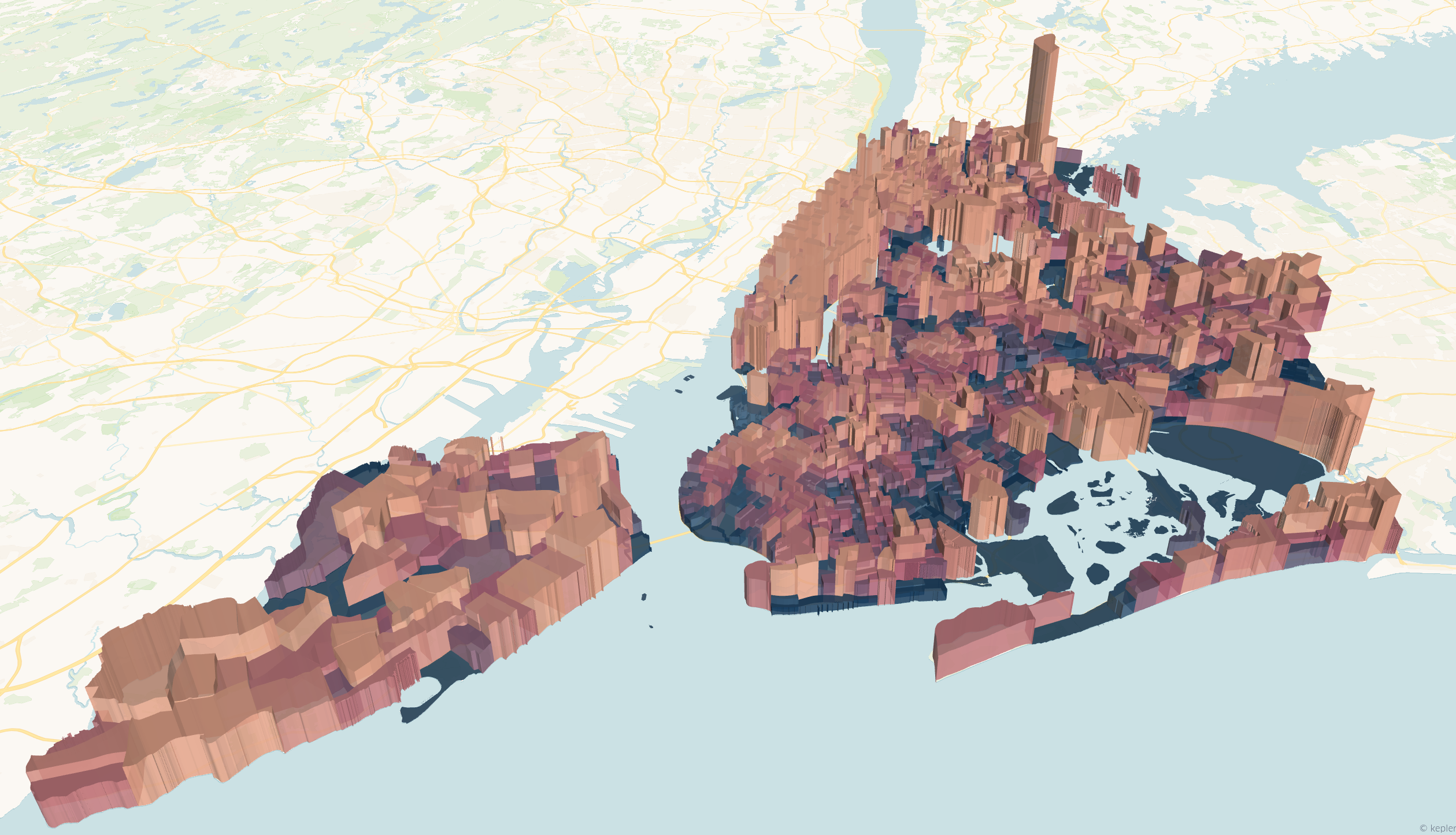
Population (3D) in New York City.
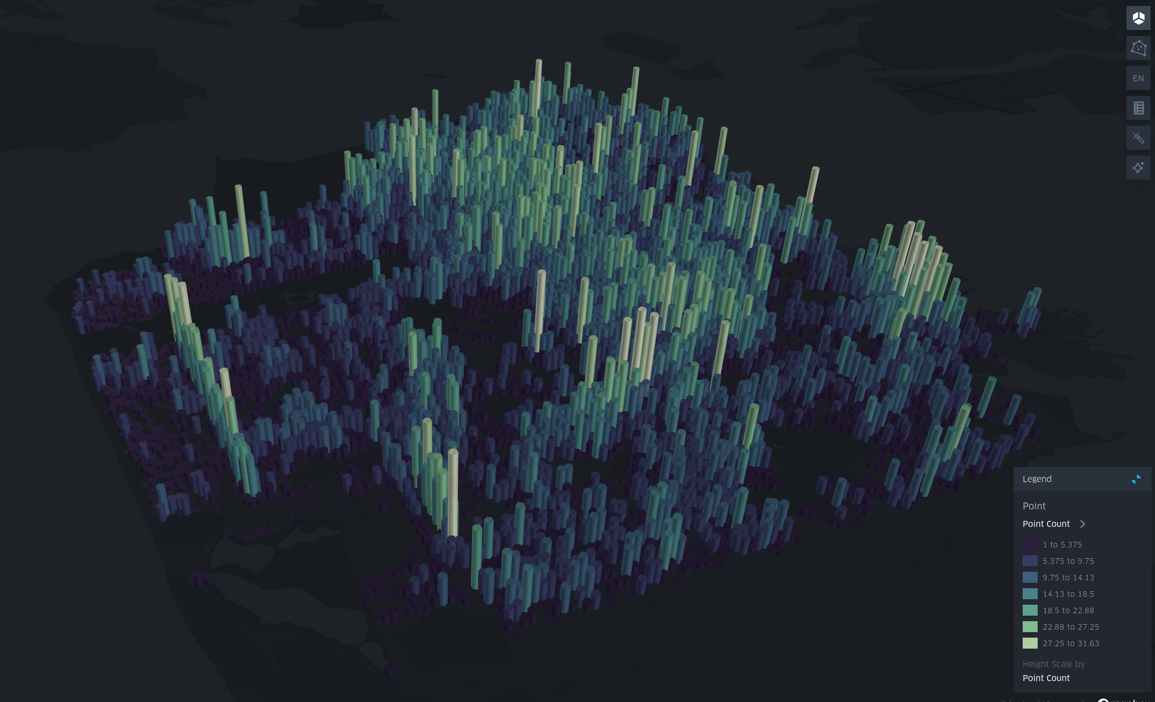
Tree density in San Francisco.