An Example - The Healthcare Resource Accessibility

The demonstration page: the link
Motivation
Background
As one of the most densely populated countries in the world, Singapore faces challenges in ensuring equal access to healthcare for all. The high population density has increased the demand for healthcare services, putting strain on the country’s medical infrastructure.
Although clinics are located in every neighborhood, the quality and intensity of healthcare services vary in different parts of the city-state, leading to disparities in access.
Additionally, healthcare services in different geographic areas may experience varying levels of demand, subsequently affecting their ability to provide high-quality care to patients.
It is thus critical to assess the spatial distribution of the availability and accessibility of healthcare services.
Problem
The spatial distribution of the availability and accessibility of healthcare services requires more exploration and analysis.
Audience
Urban planners
General Public
Data
ISP Clinic locations
Population distribution
Road network
Hexagons (800m size)
Solution
This project presents a framework to measure the healthcare intensity by combining two popular models: radiation models and 2-step floating catchment area (2SFCA).
Visualization
After the flows were estimated and healthcare intensity were calculated, we show the results below in 4 sections:
Flow Estimation Map
Movements between Planning Area
Distribution of Travel Distances
Service Intensity Map
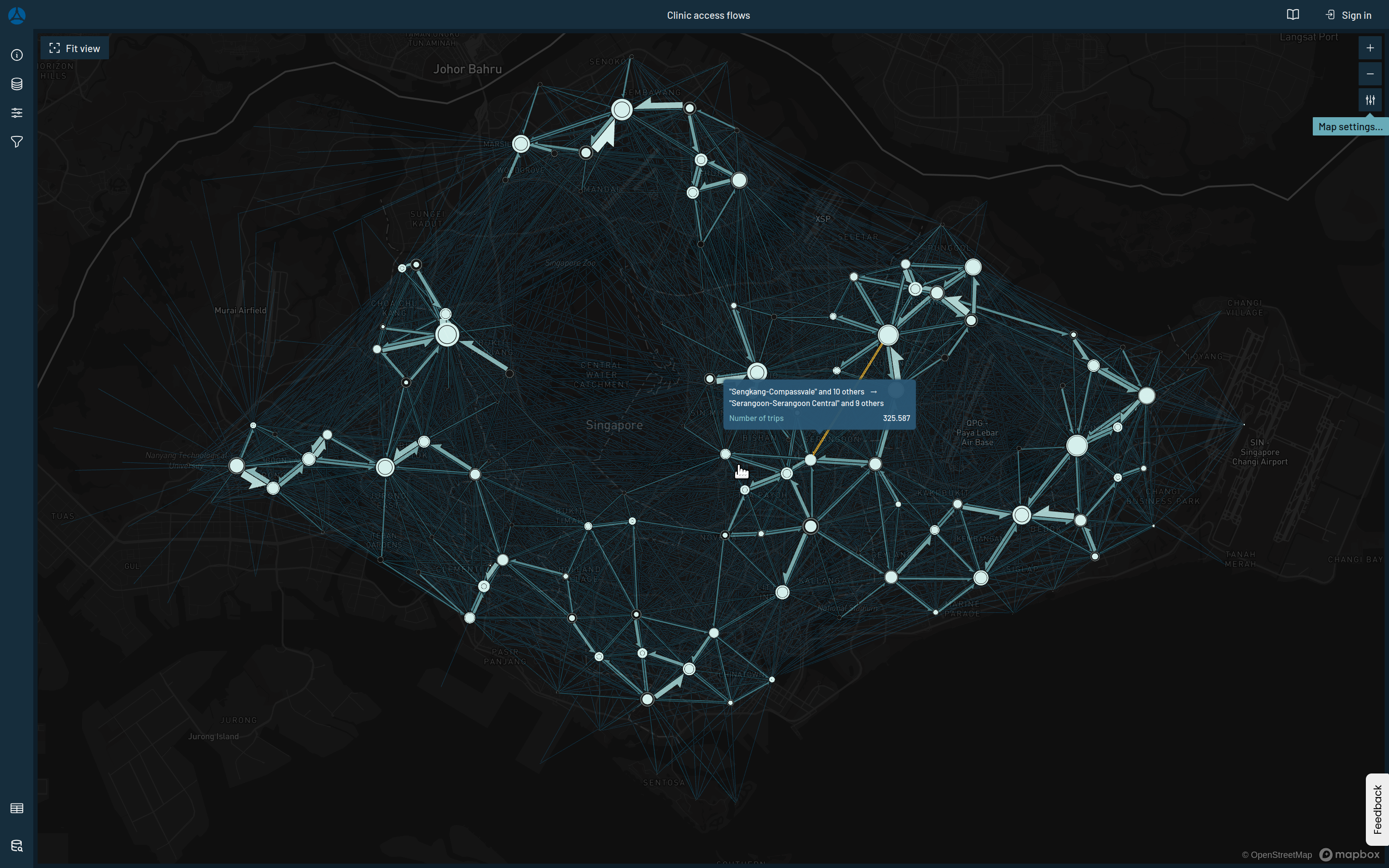
Flow Estimation Map
Estimated flow using radiation models.
Static, simple, map using arrows to show directions and colors to show above or below median.
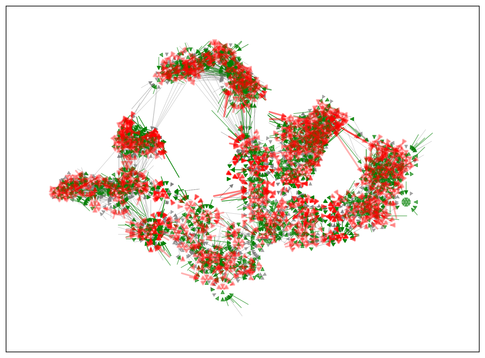
Estimated flows demonstrated with a static map.
Interactive map with the same data, using Flowmap.gl.
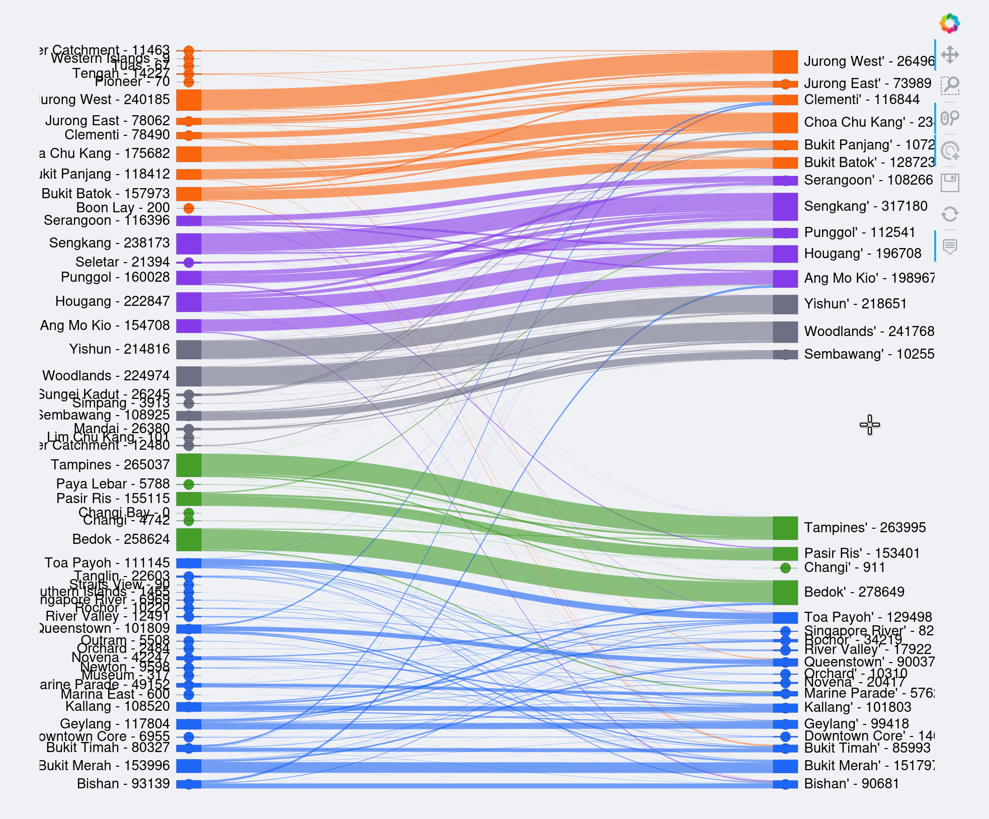
Aggregated flows by planning areas, visualize using Sankey graph (or Alluvial graph).
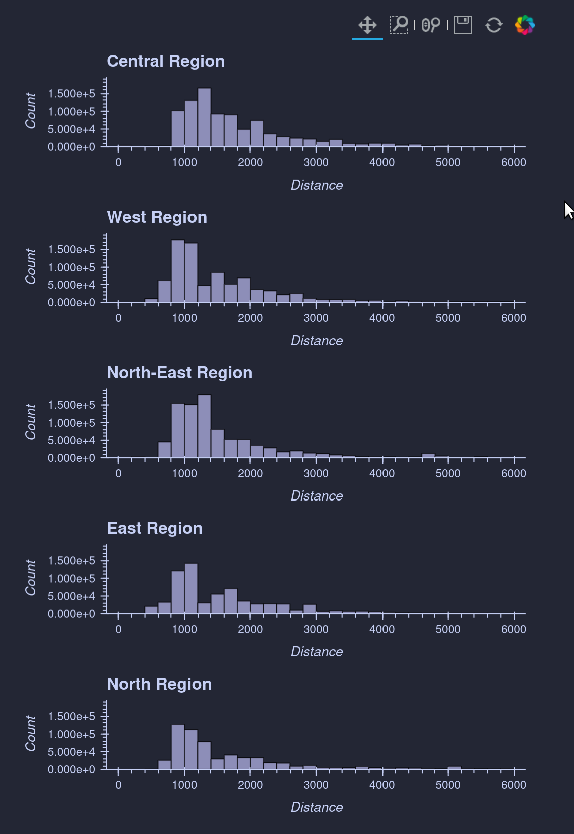
Mobility
The frequency distribution of travel distance, grouped by regions.
Accessibility Map
Accessibility to ISP Clinics estimated using 2SFCA. Hexagon shows the service provider intensity. Circle shows the accessibility.

Reflection
What was done: The visualizations show some maps and graphs to display the population mobility for accessing healthcare service (ISP Clinic).
Resolution: For visualization purpose, the spatial units were set to 800m hexagon size, which could be too large for analyzing walkable neighborhoods (400m).
Lack of spatial: How spatial autocorelation, heterogeneity, or other spatial interactions effects may exists are not discussed.
Far from pratical: The analysis remains conceptual, and thus, further development is required before it can effectively inform practical policy-making.
Other level of resource: The visualization did not present the other level of healthcare resources, e.g., polyclinics and hospitals. Visualization for Comparison can be challenging.
- Luo, W., & Wang, F. (2003). Measures of Spatial Accessibility to Health Care in a GIS Environment: Synthesis and a Case Study in the Chicago Region. Environment and Planning B: Planning and Design, 30(6), 865–884. 10.1068/b29120