Analyses start by viewing data. So, how to ‘view’ the data?
Table 1:A slice of HDB data table.
| Street | Flat Type | Floor Area (sqm) | Resale Age | Resale Price |
|---|---|---|---|---|
| ANG MO KIO AVE 10 | 2 ROOM | 44 | 44 | 267000 |
| ANG MO KIO AVE 3 | 2 ROOM | 49 | 46 | 300000 |
| ANG MO KIO AVE 3 | 2 ROOM | 44 | 45 | 280000 |
| ANG MO KIO AVE 3 | 2 ROOM | 44 | 45 | 282000 |
| ANG MO KIO AVE 4 | 2 ROOM | 45 | 37 | 289800 |
| ... | ... | ... | ... | ... |
Understanding frequency distribution A frequency distribution is a representation, usually in the form of a table or graph, that illustrates the number of occurrences (frequency) of each unique value or range of values within a given dataset. This visual or tabular summary of data distribution allows us to understand the spread, shape, and central tendency of the data, providing initial understanding of the underlying patterns and structures in the dataset.
Examples of frequency distribution
And the measures of central tendency and spread.
(a): Bar chart (for discrete variable) (b): Histogram (for continuous variable)
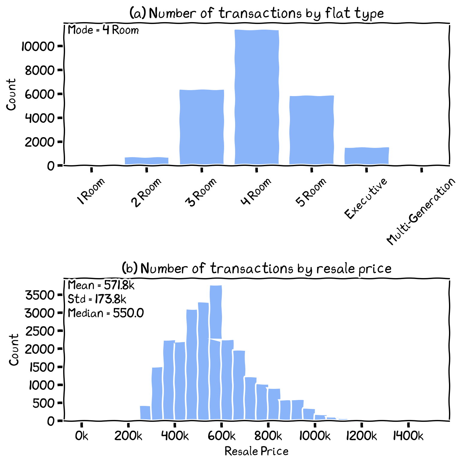
The frequency distribution of resale transactions by: (a) flat type and (b) resale price.
Frequency Distribution and Density Function
Understanding PDF and CDF
Probability Density Function (PDF):
A mathematical function representing the relative likelihood of observing a continuous random variable in a specific range of values.
PDFs have non-negative values, and their total area under the curve equals.
Different PDF shapes correspond to various probability distributions (e.g., normal, exponential).
Cumulative Distribution Function (CDF):
Calculates the cumulative probability of a random variable being less than or equal to a given value.
The CDF value at a point x corresponds to the area under the PDF curve to the left of x.
CDFs are useful for assessing probabilities of events within a specific range.
The PDF and CDF are complementary tools in probability and statistics, providing insights into the distribution and likely outcomes of continuous random variables. PDFs offer a detailed view of relative likelihoods, while CDFs show the accumulated probabilities over a range of values. Together, they enable a comprehensive understanding of data distributions and facilitate various statistical analyses.
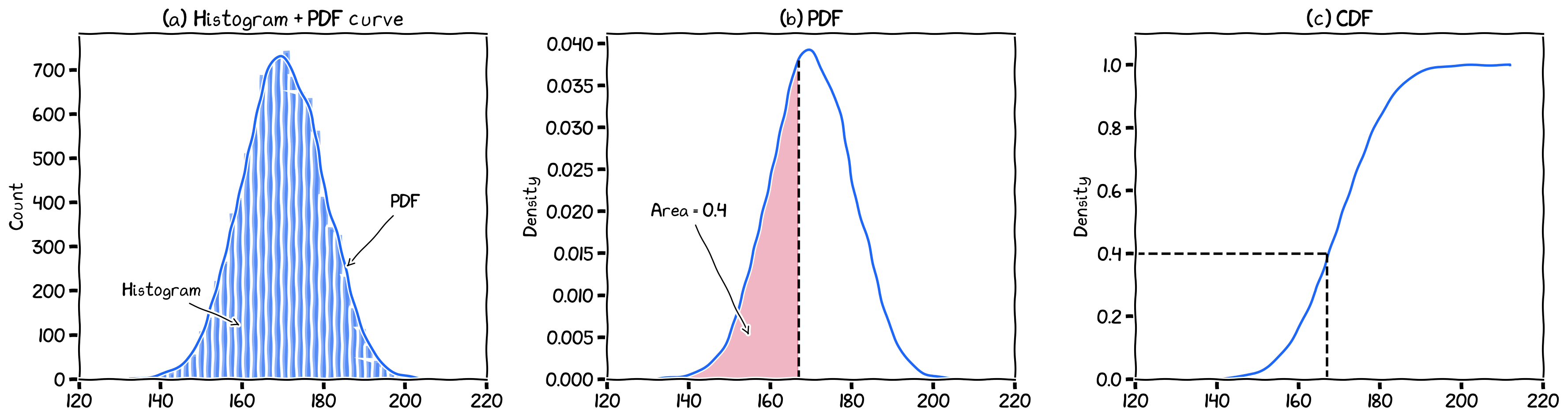
The (a) histogram, (b) PDF, and (c) CDF. In CDF, the x-axis value (167) that correspond to the y (density) value of 0.4 means that all the smaller values () contains 40% of the data points.
The PDF here is estimated from an empirical data series using Kernel Density Estimation (aka KDE).
If Y-axis shows count, then it should be a histogram, and if it shows ‘density’, then is should be either PDF or CDF.
Interpreting Frequency Distributions
Measure of Central Tendency
Gravitational center: mean, aka arithmetic mean
Middle value: median
Most frequent value: mode
Measure of Spread
Range and inter-quartile range
Standard deviation and variance
Measure of Shape
Symmetry: Mirrored between left and right of central line
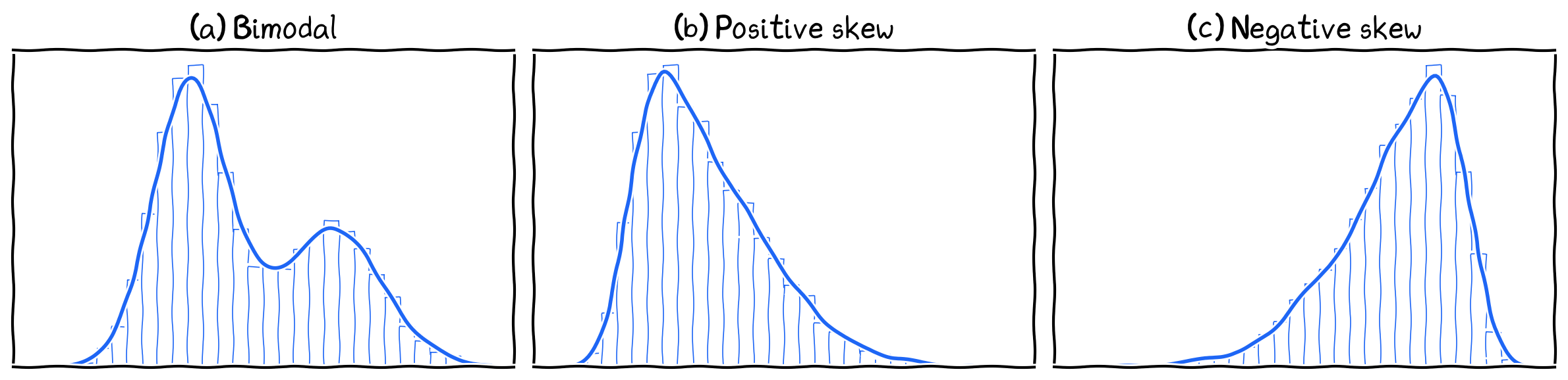
Skewness: Has a long tail on right (positive skew) or left (negative skew)
Modality: Number of peaks
Kurtosis: Steepness of peak compared to a normal distribution
what are the other ‘mean’ besides ‘arithmetic mean’?
Symmetry
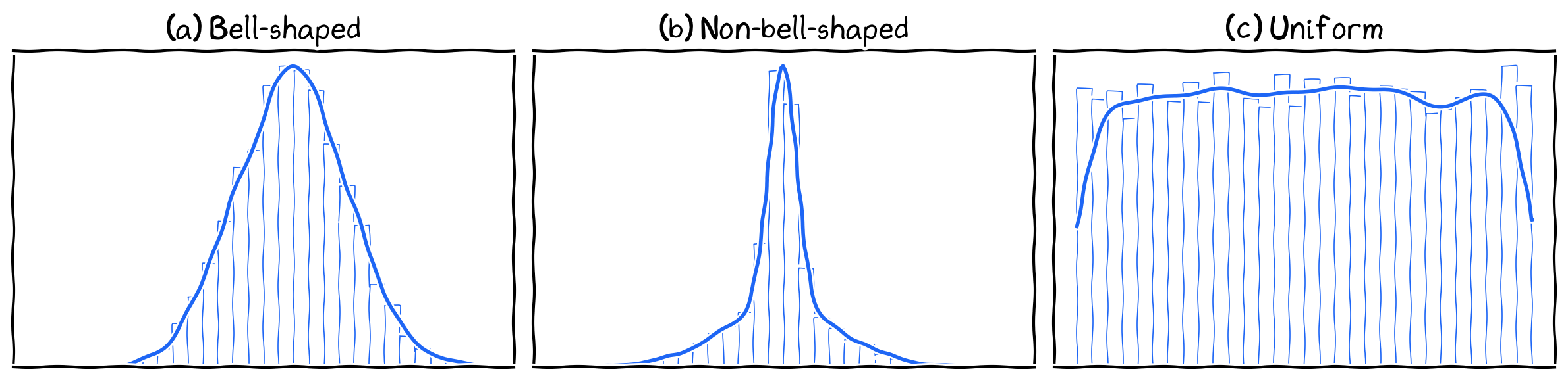
Symmetrical shapes.
Asymmetry
Asymmetrical shapes.
Modality
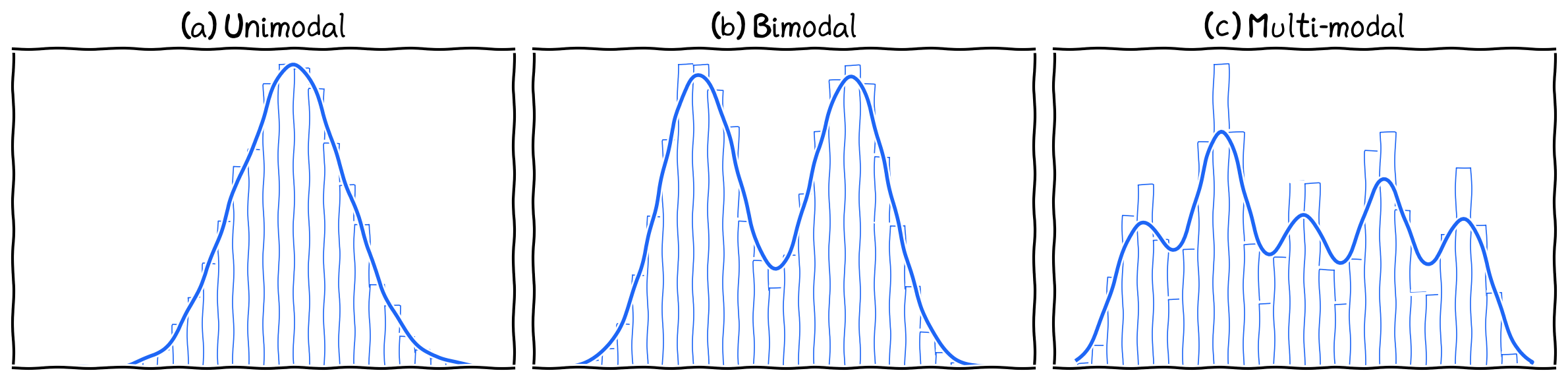
Various modality shapes.
Kurtosis
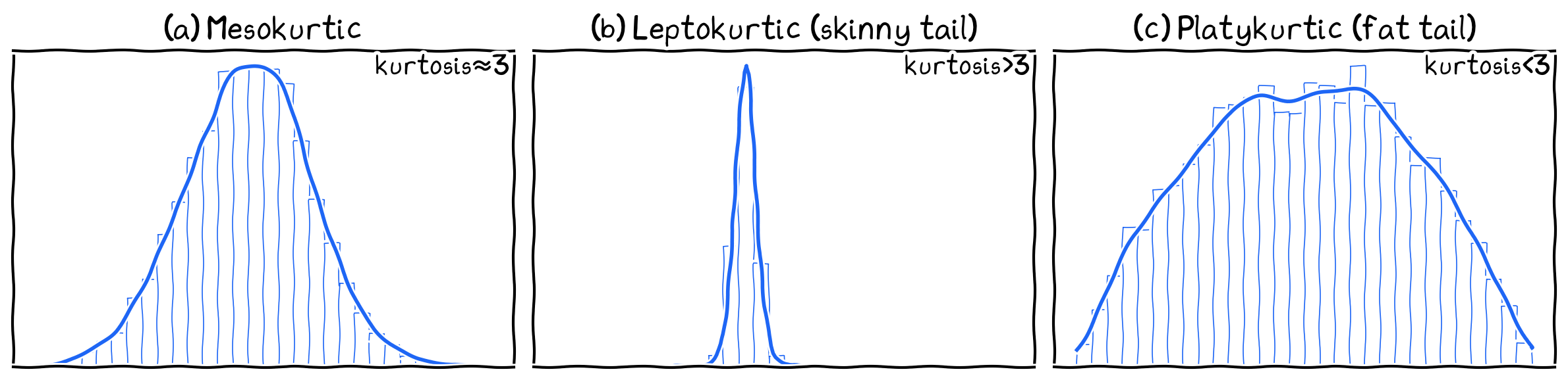
Various Kurtosis shapes.
Common Types of Frequency Distributions
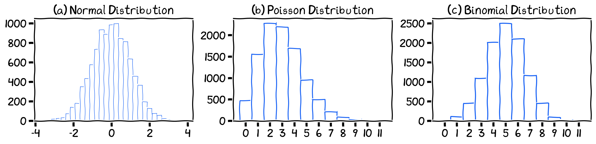
Three common types of distribution.
Normal Distribution
The normal distribution, also known as the Gaussian distribution or the “bell curve,” is often used to model continuous variables in various fields. It is particularly useful in statistics because of the Central Limit Theorem, which states that the distribution of sample means approaches a normal distribution as the sample size increases. The normal distribution has applications in many areas, such as finance, psychology, and engineering.
Many real-world phenomena, such as heights, IQ scores, and measurement errors, tend to follow a normal distribution. As a result, the normal distribution plays a central role in statistics and is used as a basis for many statistical tests and analyses.
The normal distribution is defined by two parameters---the mean () and standard deviation ().
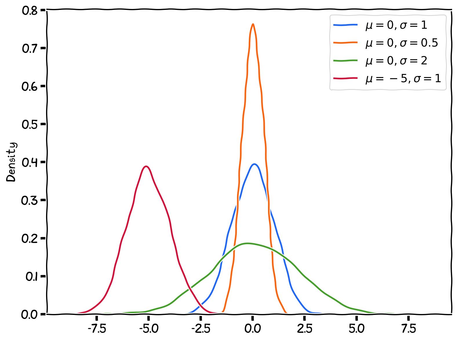
Normal Distribution with various paramters ( and ).
Poisson Distribution
The Poisson distribution is used to model discrete count data, such as the number of occurrences of a particular event within a specific time interval or spatial area. It is often applied to scenarios where events happen at a certain average rate, and each event is independent of the others. It has applications in various fields, such as telecommunications, insurance, and biology.
The Poisson distribution is ideal for modeling count data involving rare events. In many real-world situations, count data often represent occurrences of rare events.
The Poisson distribution is characterized by a single parameter, lambda (λ), which represents the average rate of events over a given time interval or a specific area.
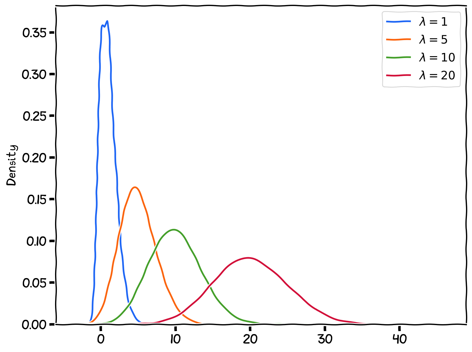
Poisson Distribution with various paramters ().
Binomial Distribution
The binomial distribution is also used for discrete data, specifically for modeling the number of successes in a fixed number of independent trials. Each trial has only two possible outcomes (e.g., success or failure, true or false), and the probability of success remains the same across all trials. It is frequently applied in areas such as quality control, marketing research, and opinion polls.
The binomial distribution provides a straightforward way to calculate the probability of observing a specific number of successful outcomes in a fixed number of trials. This makes it easy to understand and communicate the results of analyses using binomial distributions.
The binomial distribution involves two parameters: number of trials and the probability of success (or being one of the two options).
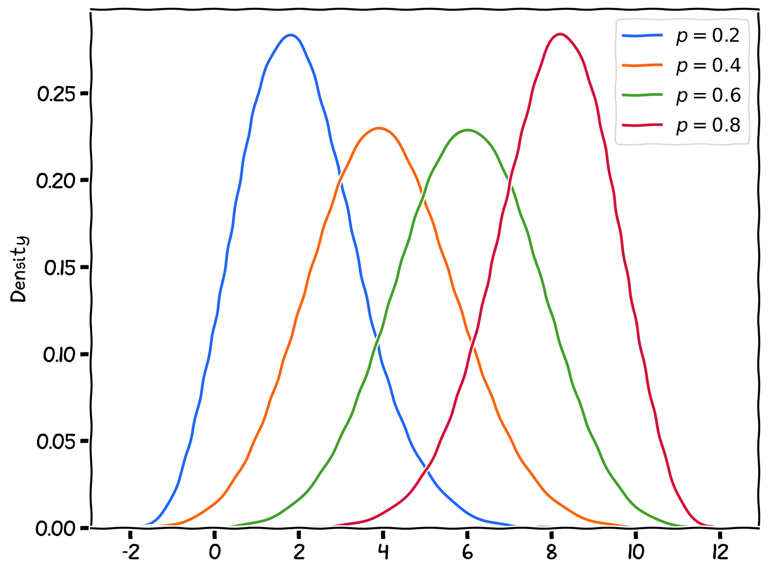
Binomial Distribution with various paramters. Number of trials is fixed at 10.
Visualizing Frequency Distributions
Histogram
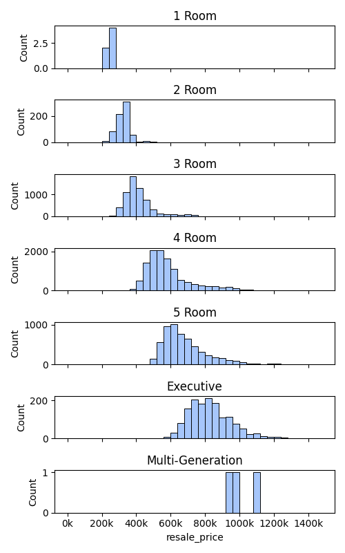
Histogram of resale prices, differentiated by flat types.
PDF plot
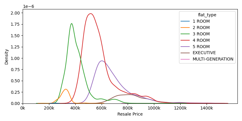
PDF of resale prices, differentiated by flat types.
CDF plot
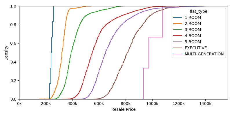
CDF of resale prices, differentiated by flat types.
Box plot
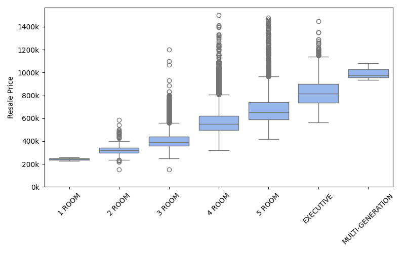
Box plot of resale prices, differentiated by flat types.
Boxen plot
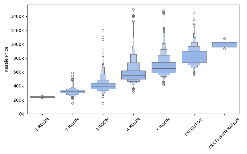
Boxen plot of resale prices, differentiated by flat types.
Joint grid plot for 2-variables
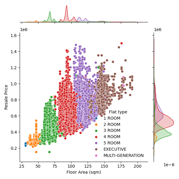
Joint grid (scatter plot and PDF) of floor area vs. resale prices, differentiated by flat types.