Sizes
Typography
Colors
Coordinate System
Arrangement
Sizes
The size of the map:
a ‘full’ width figure in an A4 paper (e.g., thesis, reports)
a ‘half’ width figure in an A4 paper (i.e., to fit in one column of a two columns layout)
as one of the element inside an A1 poster
a full A0 poster-size map
in a Powerpoint slide (full-page vs. as an element)
Map details
How much detail can be shown in:
a small A4-one-column map
a full A0 poster-size map
Two thinking directions:
What should be added --- the ‘plus’
What should be removed --- the ‘minus’
Considerations
DPI (dots-per-inch): the number of dots that will be drawn or printed within a one-inch span (in a single dimension).
Think:
What happens when you put an A0-size map/image inside an A4 paper?
How does a 2cm line in the original A0 map look on the A4 paper?
Take home message: Always plan ahead about what size of map to be drawn.
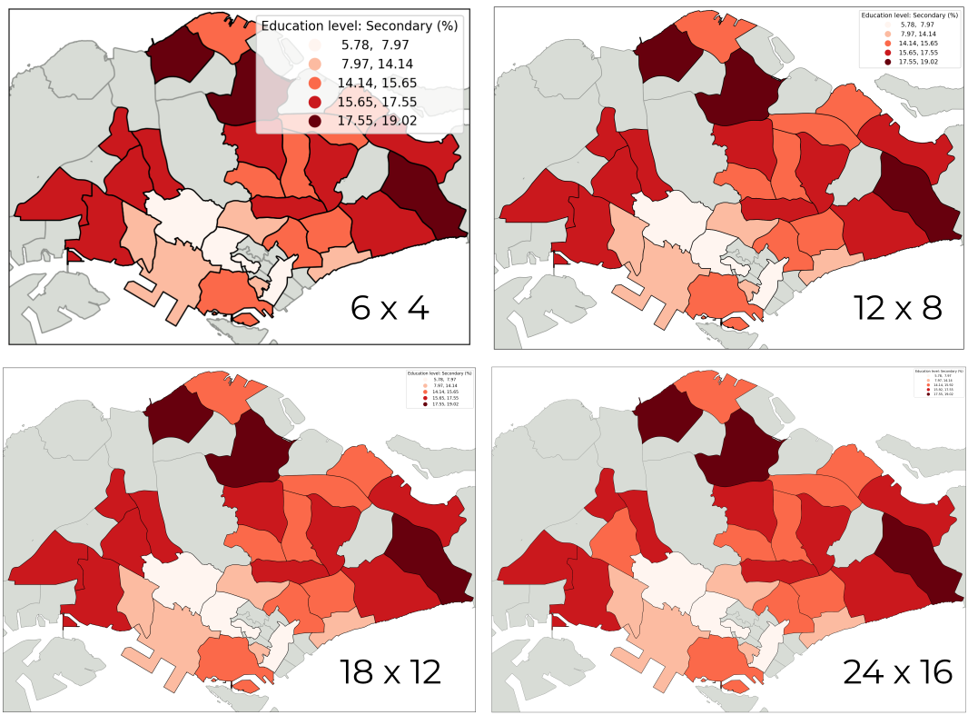
Figure 1:The same map export with different size, squeezed to the same display size.
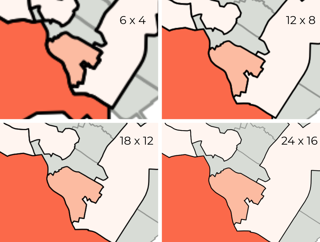
Figure 2:The same 4 maps, zoomed-in.
Typography
Typography most often serves to label cartographic elements. It is a “functional symbol” primarily, and secondarily an aesthetic element meaning that it carries cartographic meaning and is not simply “window dressing”.
Font Family (Serif, Sans-Serif, Decorative, Monospaced)
Font Size (relative to map size)
Font Weight (Bold (700) vs. Regular (400) vs. Light (300))
Font style (italic vs. regular)
Uppercase, lowercase, title case
What is the differences between Sans Serif fonts and Serif fonts?
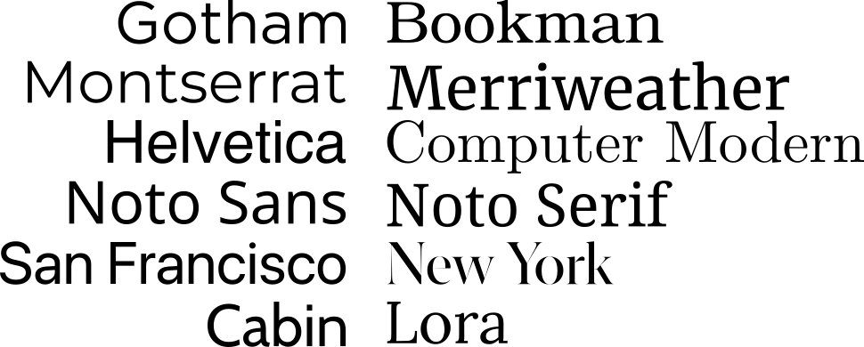
Figure 3:Some example of Sans-Serif fonts (left) and Serif fonts (right).
Figure 4:Text elements.
Things to be considered:
Visibility: make sure the labels can be viewed without zoom-in.
Hierarchy: use different sizes, weights, or styles to show hierarchy of labels.
Consistency: use the same typeface to show labels in the same level.
License: make sure the font can be used in your targeted publication or is there any restriction/subscription-needed
Publication requirement: some journal requested that some specific fonts should be used for some of the map elements.
Take home message: The top priority is to ensure that the text is clear and readable. Additionally, make sure the fonts are appropriate for your target venue.
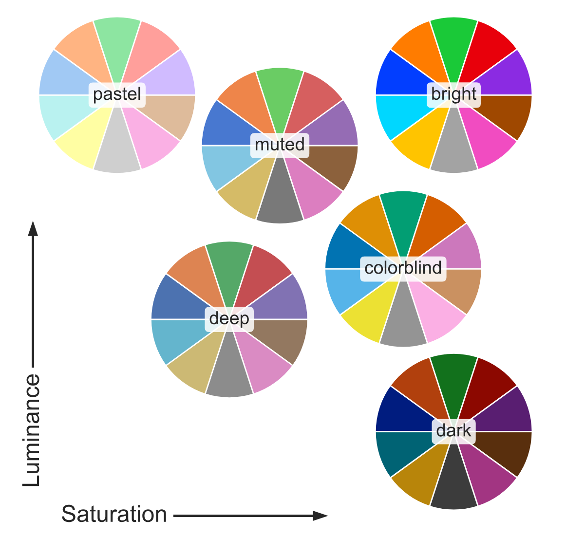
Colours
In the realm of cartography and geovisualization, color is an essential tool that serves to delineate different components and highlight their significance, thereby facilitating effective visual communication. In designing geovisualization, the application of color goes beyond aesthetics, as it enables the clear differentiation of features and allows for the accurate representation of data, making it a crucial aspect of geovisualization design.
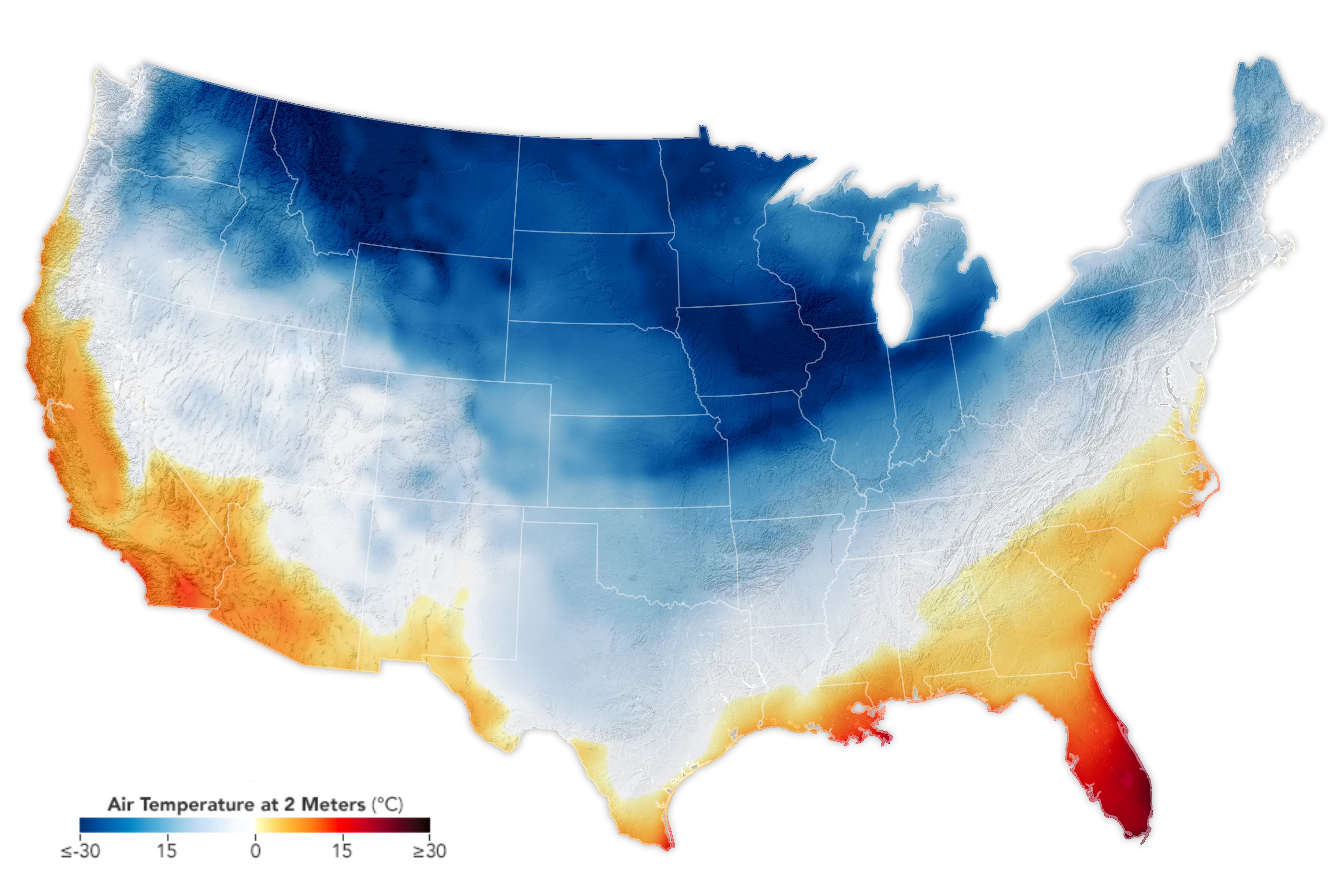
Temperature of colours. Source: NASA Earth Observatory: Arctic Chill Sweeps U.S.
Things to considered while selecting color(s):
The targeted audiences or venues: color or black and white (and grey)?, colorblind? etc....
Types of values:
Qualitative/Categorical
Quantitative/Sequential:
discrete: Q1, Q2, Q3, Q4; levels after ‘breaks’; age groups...
continuous: scaled data from 0 to 1, with a min-value and max-value, exact age...
Diverging: with a center value (e.g., 0)
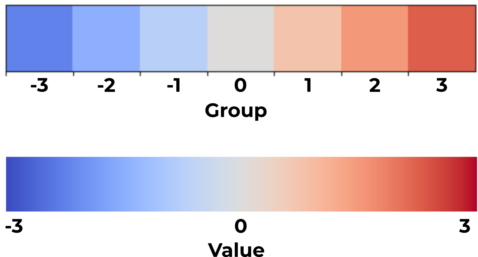
Discrete vs. Continuous.
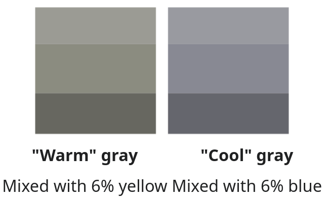
Temperature of colours:
cold colors for low values,
hot colors for high values, etc.
Color temperature from Wikipedia.
The meaning of data:
green-series colours for greeneries level, or safety level, etc.
red, orange colours for dangerous level, or warning level...
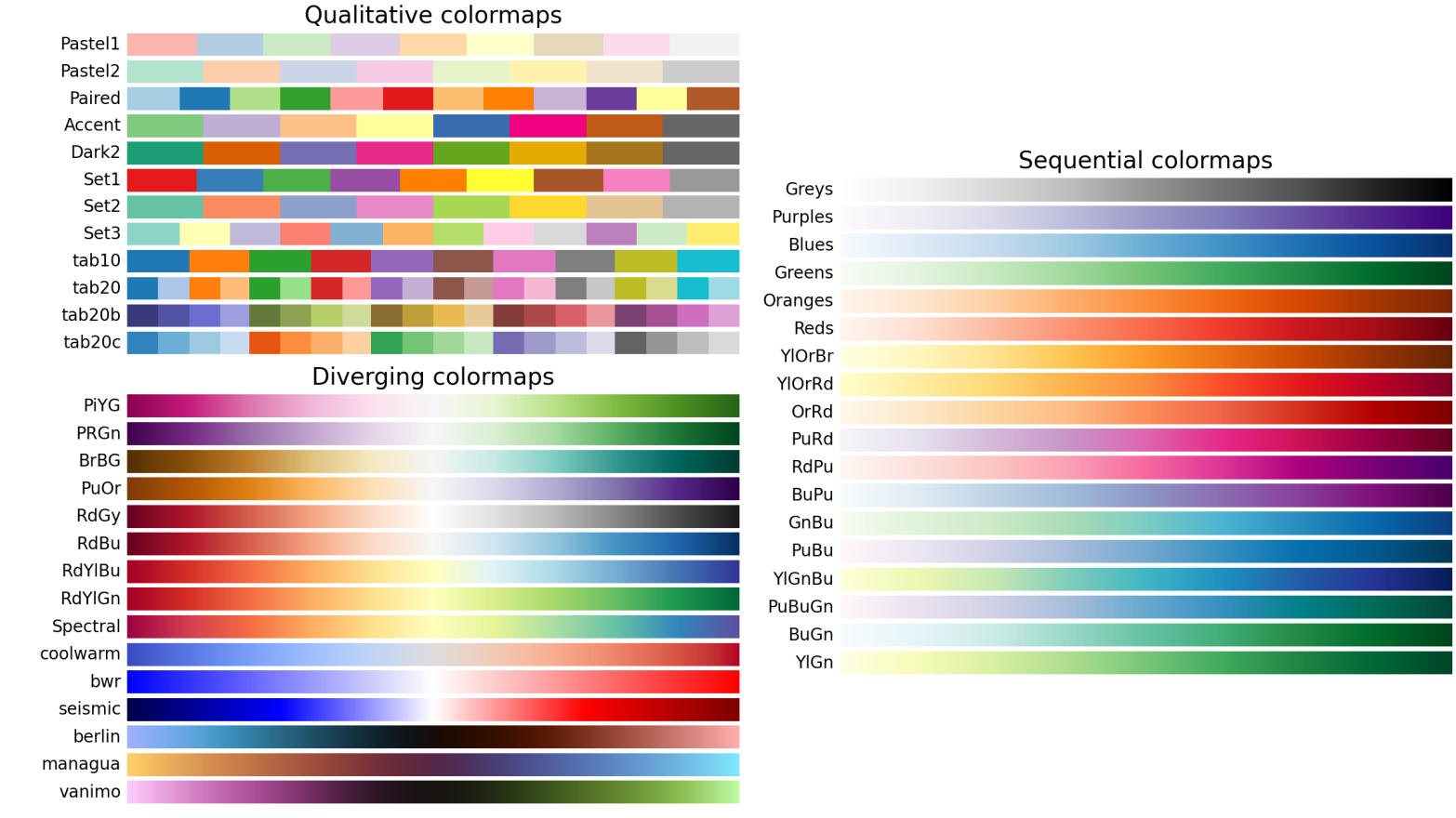
Figure 6:Some example of colormaps from Matplotlib.
Two basic colour models:
CMYK: allows for more precise control over how colors appear on printed materials.
four integer values ranging from 0 to 100, each value corresponding to the percentage of ink coverage for Cyan, Magenta, Yellow, and blacK components.
RGB: allows for precise control over how colors appear on digital devices.
three integer values ranging from 0 to 255, each value corresponding to the intensity of the Red, Green, and Blue lights.
How to use colors in Python (Matplotlib):
named colors:
'red','blue','green','white', full list herexkcd colors:
'xkcd:off white', full list herespecifying R, G, & B in the ranging from 0 to 1 (divided by 255):
(0.1, 0.2, 0.5)specifying R, G, B, & alpha in the ranging from 0 to 1 (alpha as proportion):
(0.1, 0.2, 0.5, 0.7)specifying RGB hex code:
'#0f0f0f'specifying RGBA hex code:
'#0f0f0fff'
Coordinate System
All maps are drawn with a specific coordinate reference system (CRS), which defines how the geographic coordinates of features on the Earth’s surface are represented in a flat, two-dimensional plane (i.e., map). There are two main types of CRS: unprojected and projected. See proj for a series of different global projections and The Morphing Map Project to see how projections are different from each other.
Unprojected CRS
Uses latitude (N-S) and longitude (E-W) coordinates in degrees.
Represents Earth’s curved surface.
Projected CRS
Transforms Earth’s curved surface into a flat map (in length, e.g. meters).
Different types:
Mercator: Preserves angles and directions, used in navigation.
Equal Area: Preserves area, useful for spatial analysis.
Conic: Preserves shape and angles, used for mid-latitude regions.
Each map projection serves different purposes and has its own advantages and disadvantages in terms of preserving shape, area, distance, and direction. The choice of projection depends on the specific needs and applications of the map.
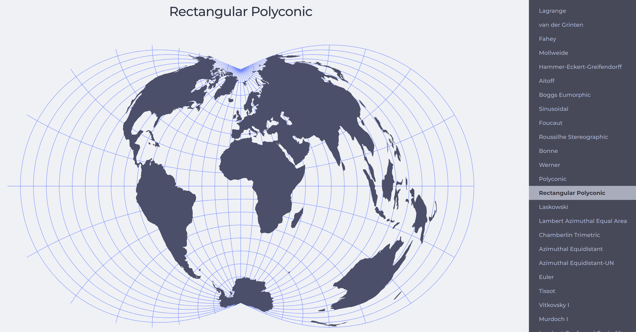
Figure 8:[Try and view the differences of various projections in The Morphing Map Project.
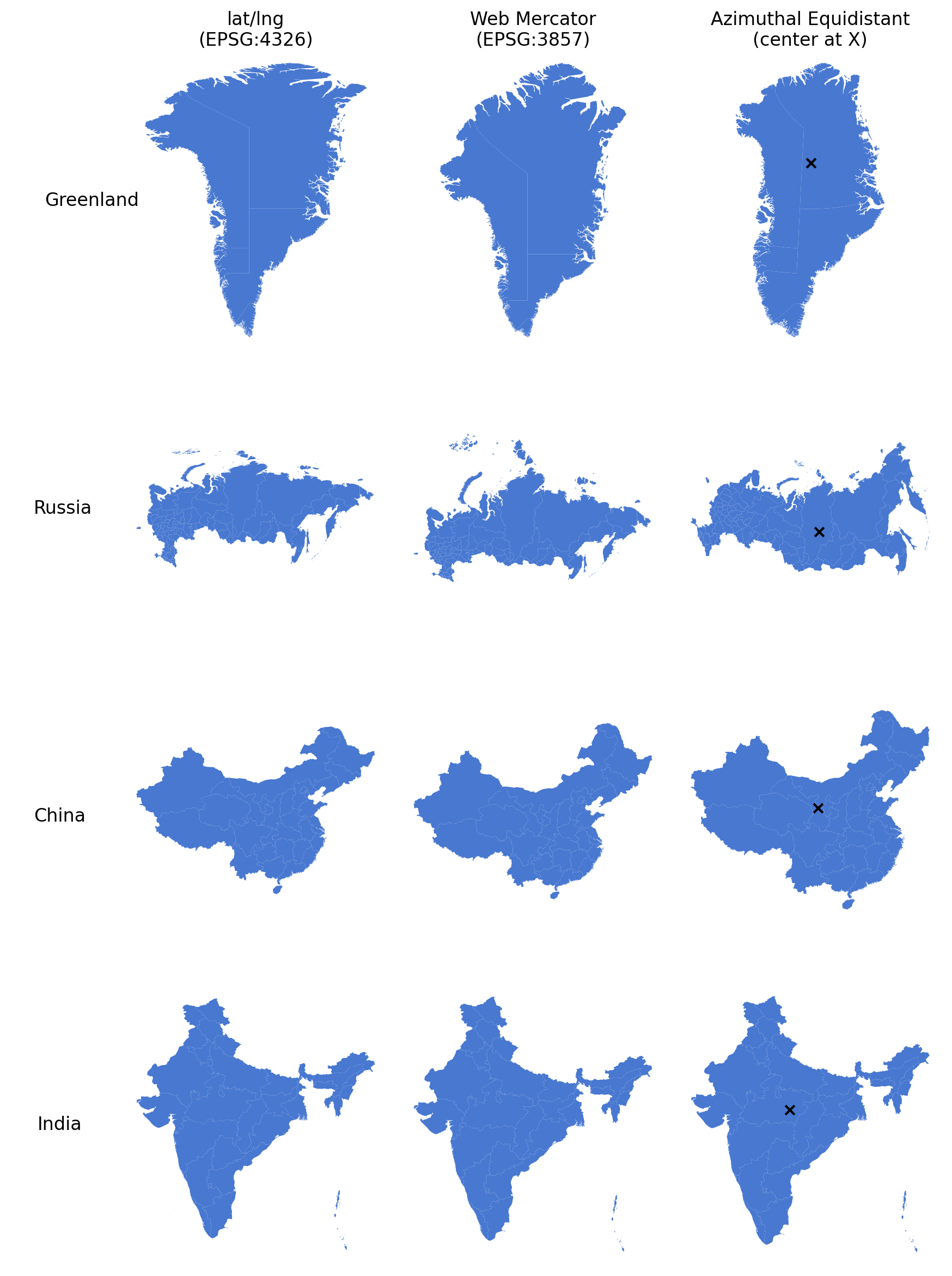
Figure 9:The four countries in three different projections.
How to use CRS in Python
Here we demonstrate how to change to the Singapore projection See EPSG:3414 and SLA on SVY21 / Singapore TM for more details.
import geopandas as gpd
# read the file
singapore = gpd.read_file('../path_to_file/singapore.shp')
print(singapore.crs)  # to show the projection info from the saved file

# use .to_crs() to convert between projections, usually from or to EPSG:4326

# check EPSG.io website, 3414 is the code for SVY21 / Singapore TM,
# TM means Transverse Mercator, see https://epsg.io/3414 for details
sg_prjd = singapore.to_crs('epsg:3414')
# OR
## find the targeted crs string, something look like this:
targeted_crs = '+proj=tmerc +lat_0=1.36666666666667 +lon_0=103.833333333333 +k=1 +x_0=28001.642 +y_0=38744.572 +ellps=WGS84 +towgs84=0,0,0,0,0,0,0 +units=m +no_defs +type=crs'
sg_prjd = singapore.to_crs(targeted_crs)
Arrangement
Arrangement is about the position of every element on map.
Where to put what
Which area of a map/paper will be seen first by the readers?
The hierarchy of information (see next section)
Should we draw North arrow and scale bar?
If it is a series of maps, the second and later maps could ignore the N-arrow and scale bar, for the sake of simplicity and readability.
Collective/shared legend, or separate legends for every map?
In a multi-subplots layout setting, the elements in the legend are usually same, so that the colors/sizes could be compared between subplots---in this case, one large shared legend is sufficient.
Figure title
Do we need one for a map that would be placed in a report/thesis?
It is a common practice that if the map comes with a figure caption (e.g., Fig X. figure title) then the title on top of the map should be removed.
The external (out-of-studying-scope) area
It is a better idea to draw these external area with light grey or something less attractive.
Summary
Basics of mapping
Things to be considered and planned while visualizing spatial patterns:
Sizes: The sizes of maps and each individual element (line width, point size, etc.) in a static image affect the visibility and aesthetics of the visualization.
Typography: The visibility of text is the top priority.
Colors: Consider the color temperature, relation to the subject, targeted venue, etc.
Coordinate System: Choose a commonly used and suitable projection for the targeted area.
Arrangement: Carefully consider the hierarchy of information and the placement of various elements in the map or visualization.