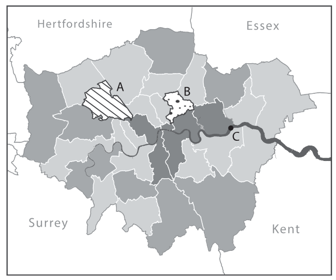
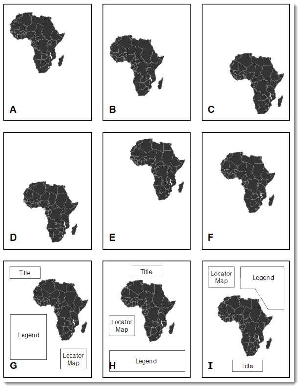
Map Elements
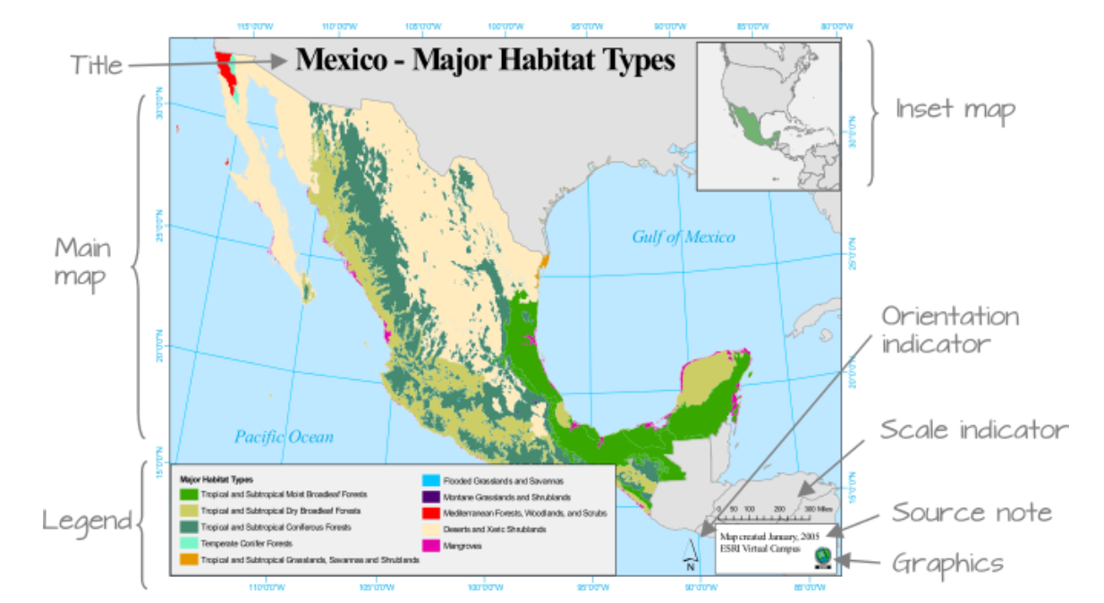
Example of map elements. source: ESRI
Title should be easily identifiable as the map’s title through its size and positioning. Sub-titles are best in a smaller type size.
Legend is a graphic guide that should comprise symbols, including colours, styles and patterns, which are not necessarily familiar to or known by the reader. A well-designed map should involve minimal reference to the legend.
Insets allow the cartographer to show areas at a more detailed scale or to reposition features that would have otherwise ‘fallen’ just off the sheet to make best use of the available page and keep the main mapping at the most appropriate scale. They may also include an overview of where the region is in a wider geographical context, known as a locator map.
Charts and figures are common to thematic maps showing geostatistical or geo-numerical data. They should be included only if they add weight to the message of the map.
North arrow or any other directional indicator is only required if the orientation is not obvious. Arrows with a clear and suitably long North-South line are easier to use than more decorative ones.
Scalebar allows users to make measurements on the map and is a quick reference to size objects. It does not have to represent distance, for example it can represent travel time.
Border is a line encasing the edges of the mapped area or a line framing the entire map layout. It is sometimes known as a neatline, a term also used for a finer border line that may form the outer part of a grid and may contain graticule intersections.
See Layout, balance, and visual hierarchy in map design in “The Routledge Handbook of Mapping and Cartography” for more details.
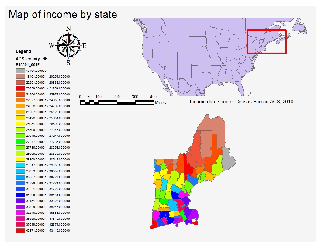
Example of bad and improved maps
Bad Map Example
Legend color
Legend range and numbers
Location of source info
North arrow (complicated)
Scale bar (complicated and alignment)
Inset map too large
Info about the numbers
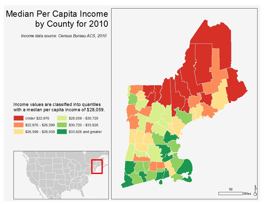
Improved Map Example
Replaced legend title with the description of the data column
Simplified north arrow and scale bar
Colours changed to divergent colormap, with the center value to be the median
Smaller inset map, better emphasized of main map
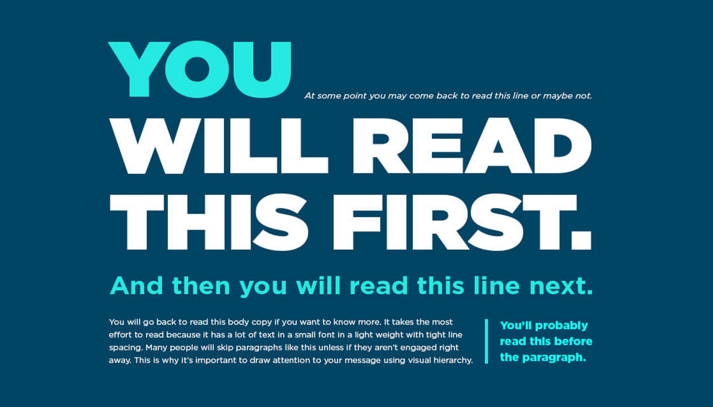
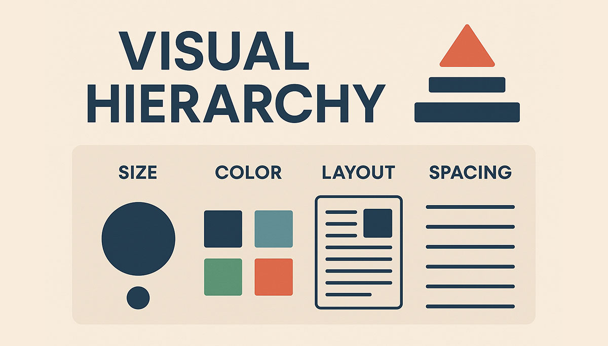
Visual Hierarchy
About how people ‘look’ for information.
Designing visual (for web UI). Source
Visual design. Source
Size / Scale Hierarchy
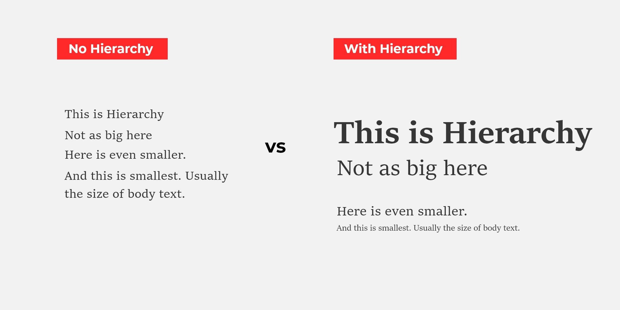
How size affect visual. Source

How size affect visual. Source

How size of fonts affect visual. Source
Colour
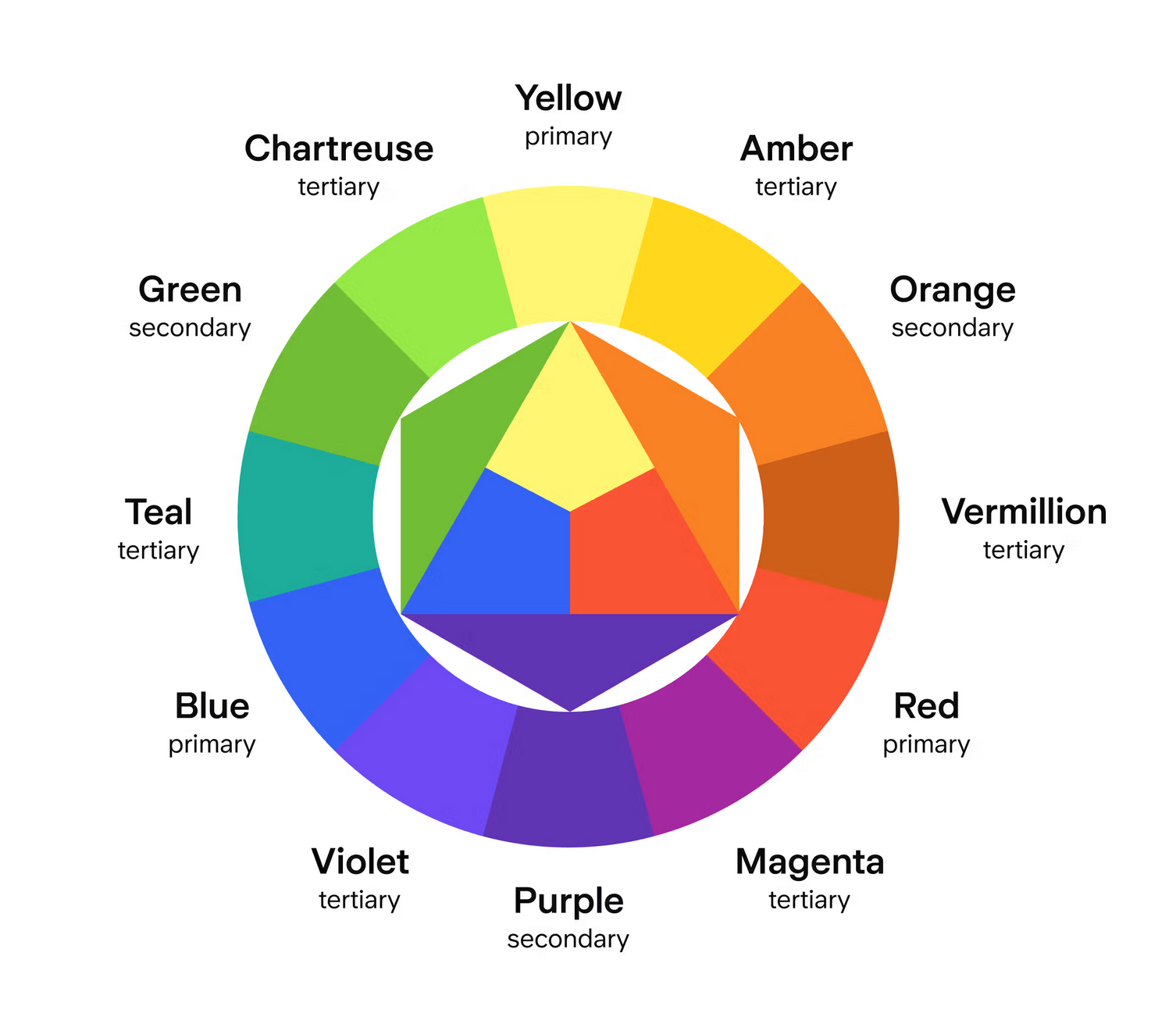
The order of colours. Source

How colour and contrast draw attention and create harmony. Source
(a)Bad
(b)Improved
Figure 11:Layout, balance, and visual hierarchy in map design in “The Routledge Handbook of Mapping and Cartography”
Layout
How people read
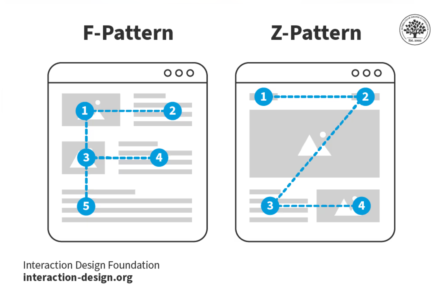
Reading pattern in UIUX. Source
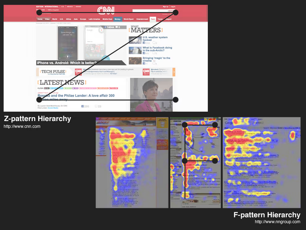
Reading pattern in UIUX. Source
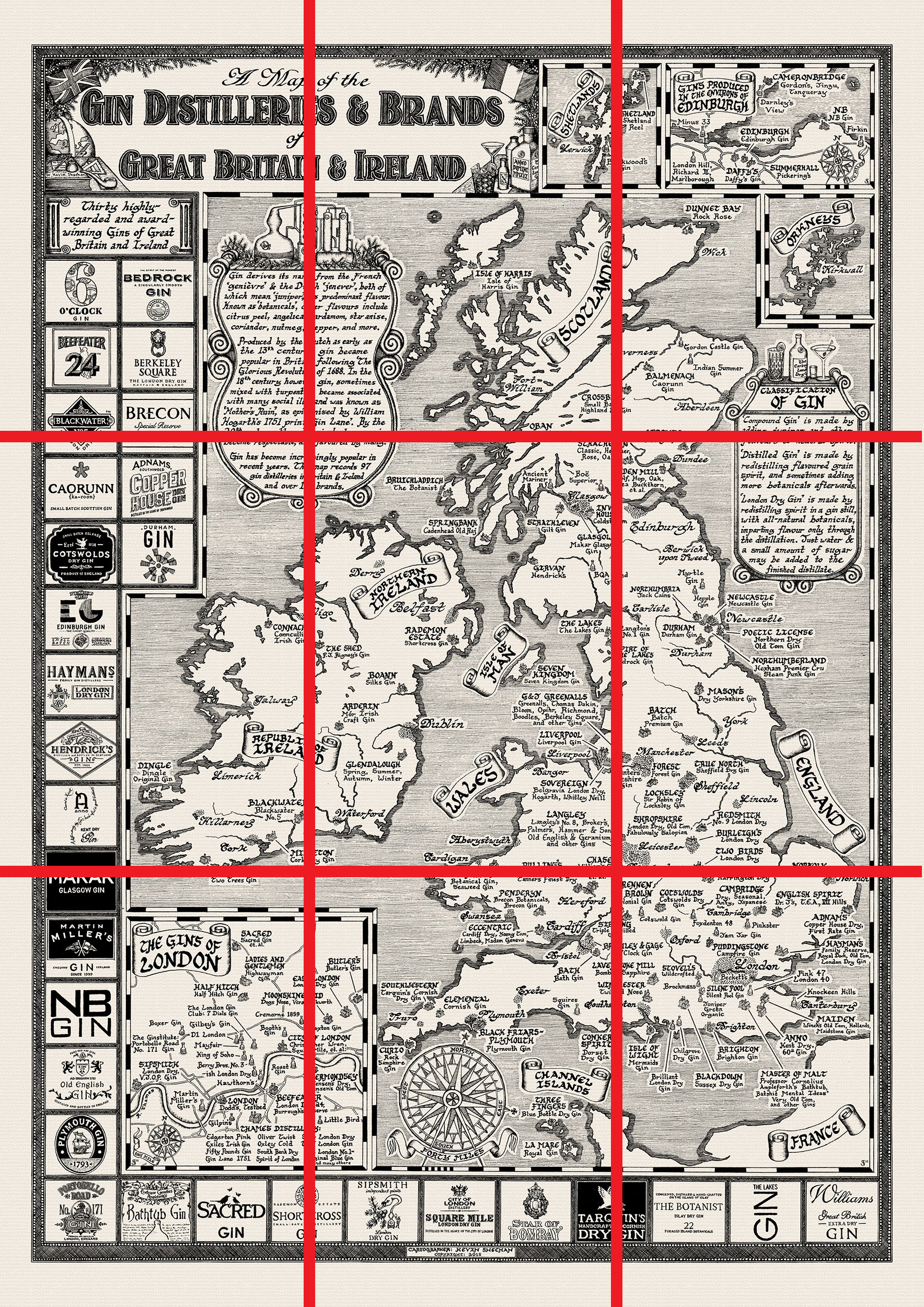
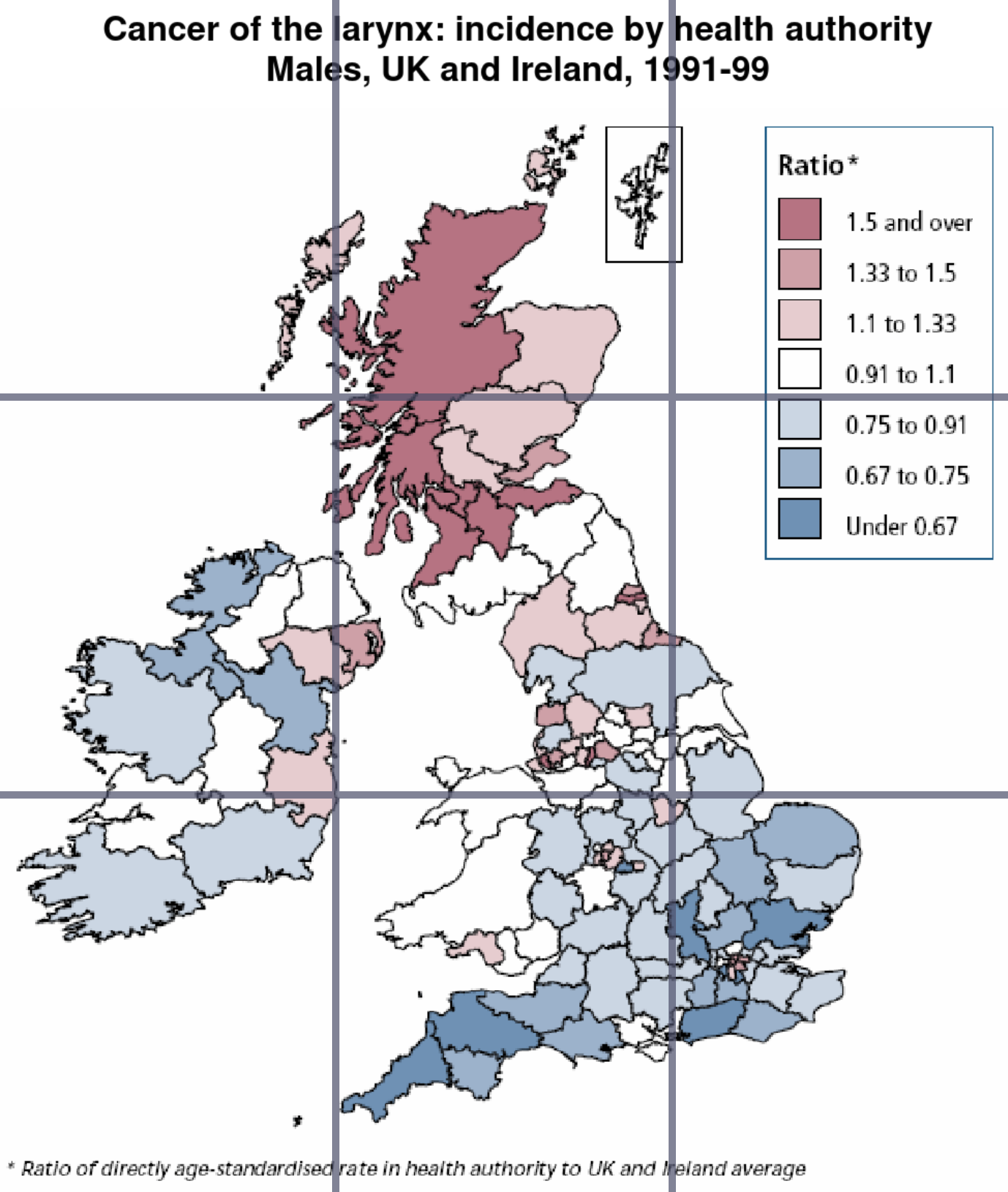
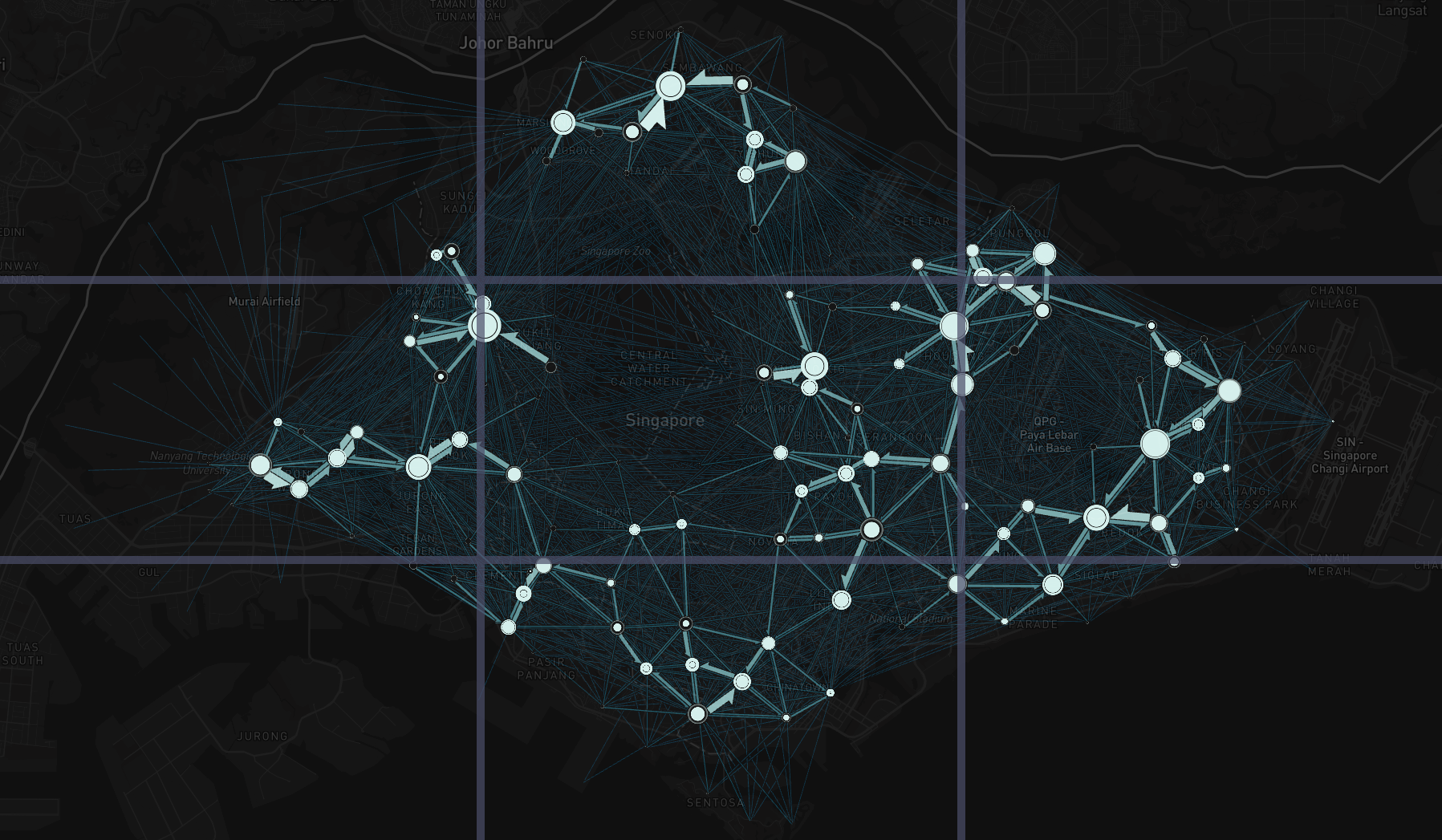
Rule of Third
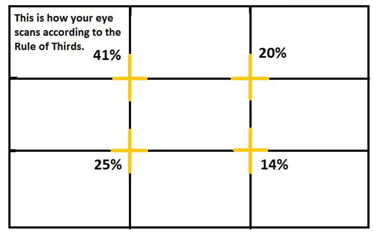
What is the rule of third. Source
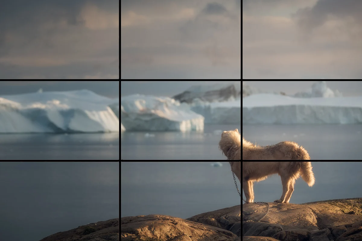
What is the rule of third. Source
What is the rule of third. Source
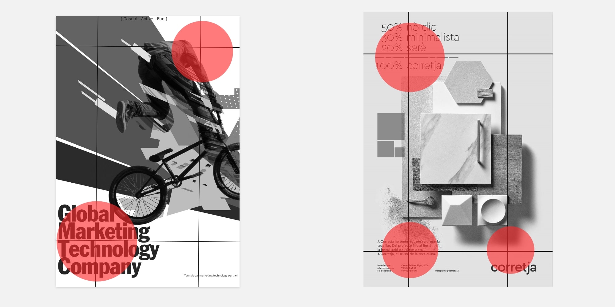
Rule of third in poster design. Source
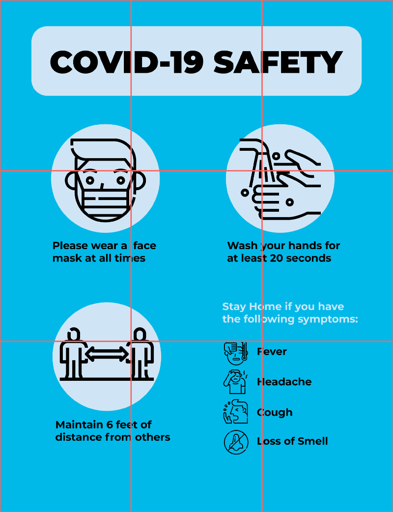
What is the rule of third. Source
What is the rule of third. Source
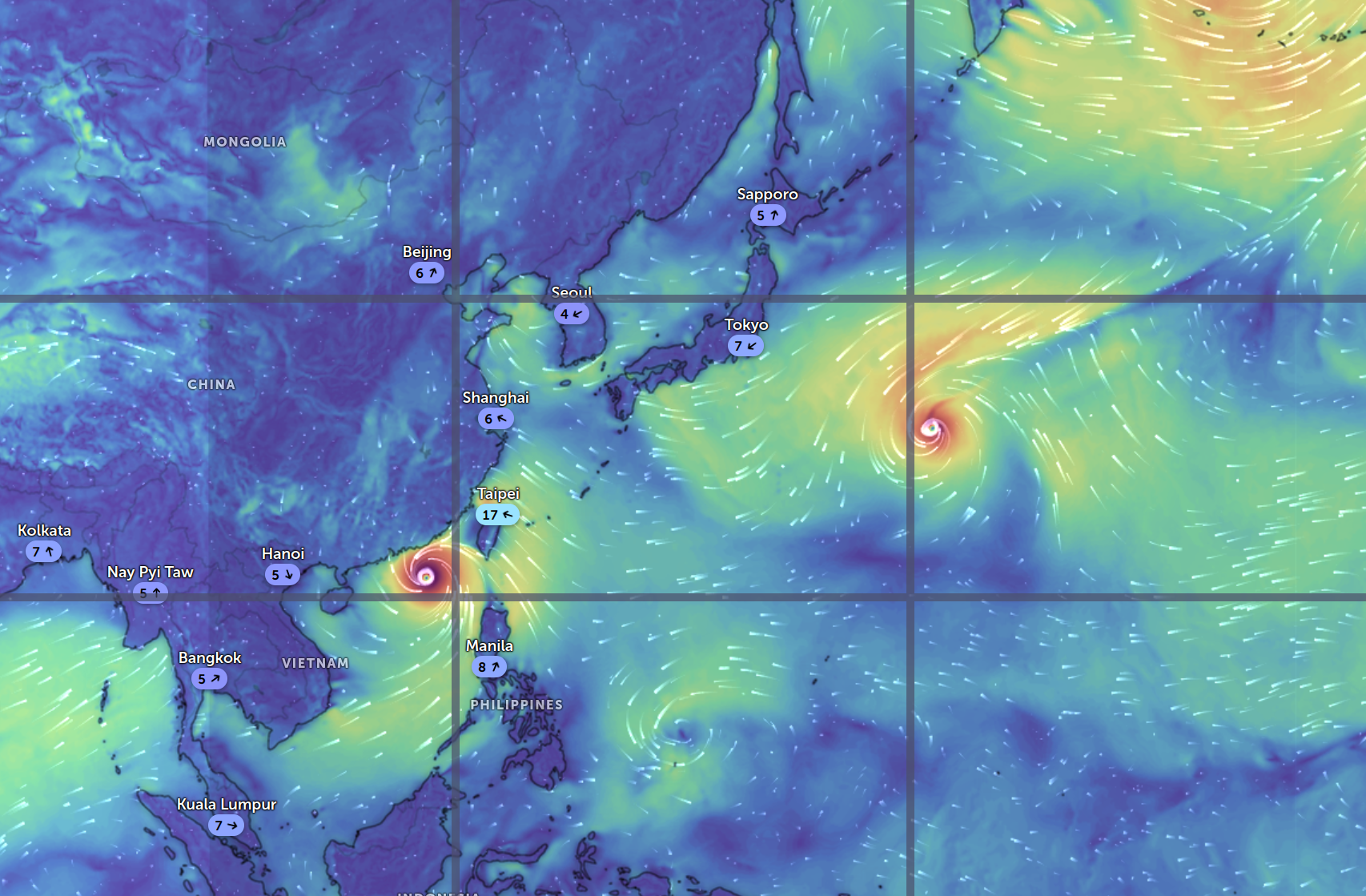
Example of rule of third in map. Using tool. Map screen short on Zoom Earth
Example of rule of third in map. Using tool.
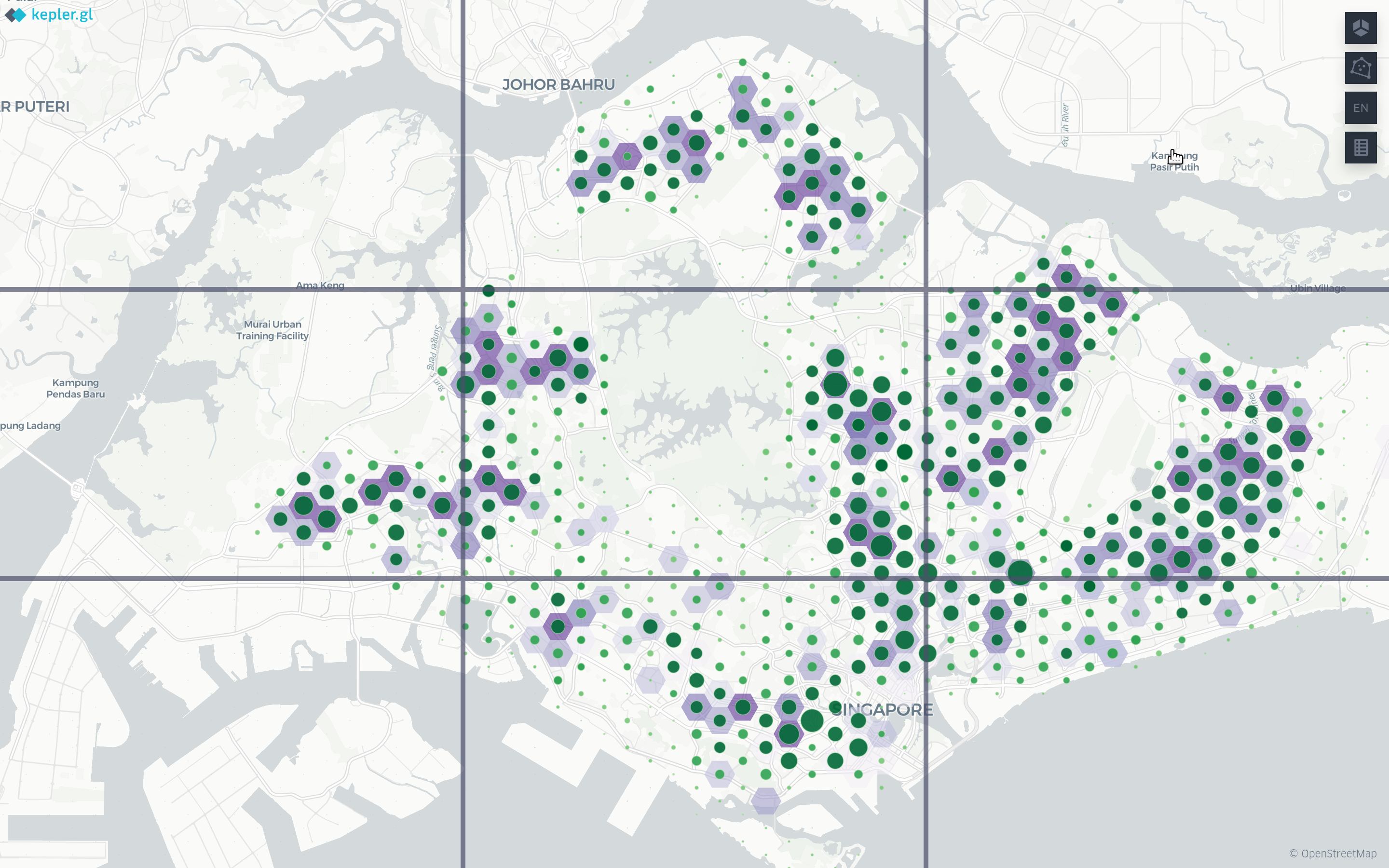
Example of rule of third in map. Using tool.
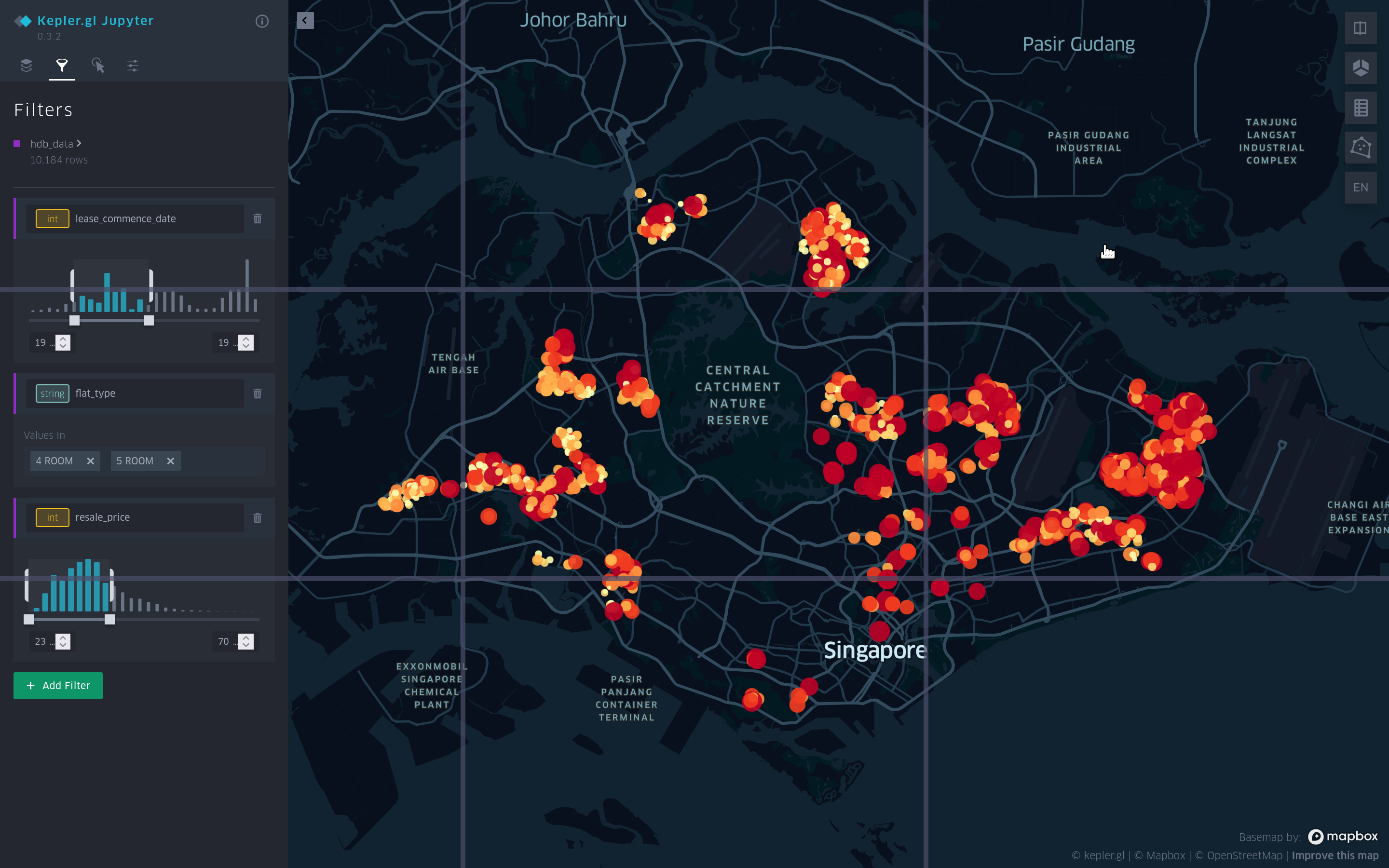
Example of rule of third in map. Using tool.
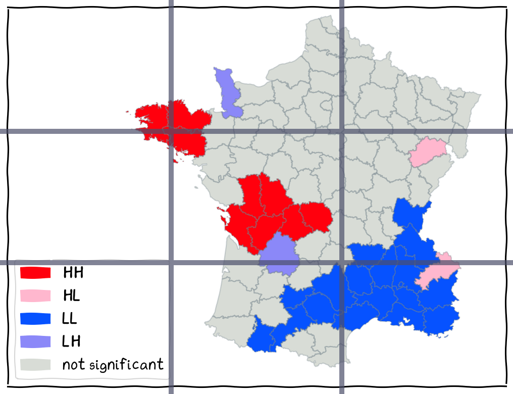
Example of rule of third in map. Using tool.
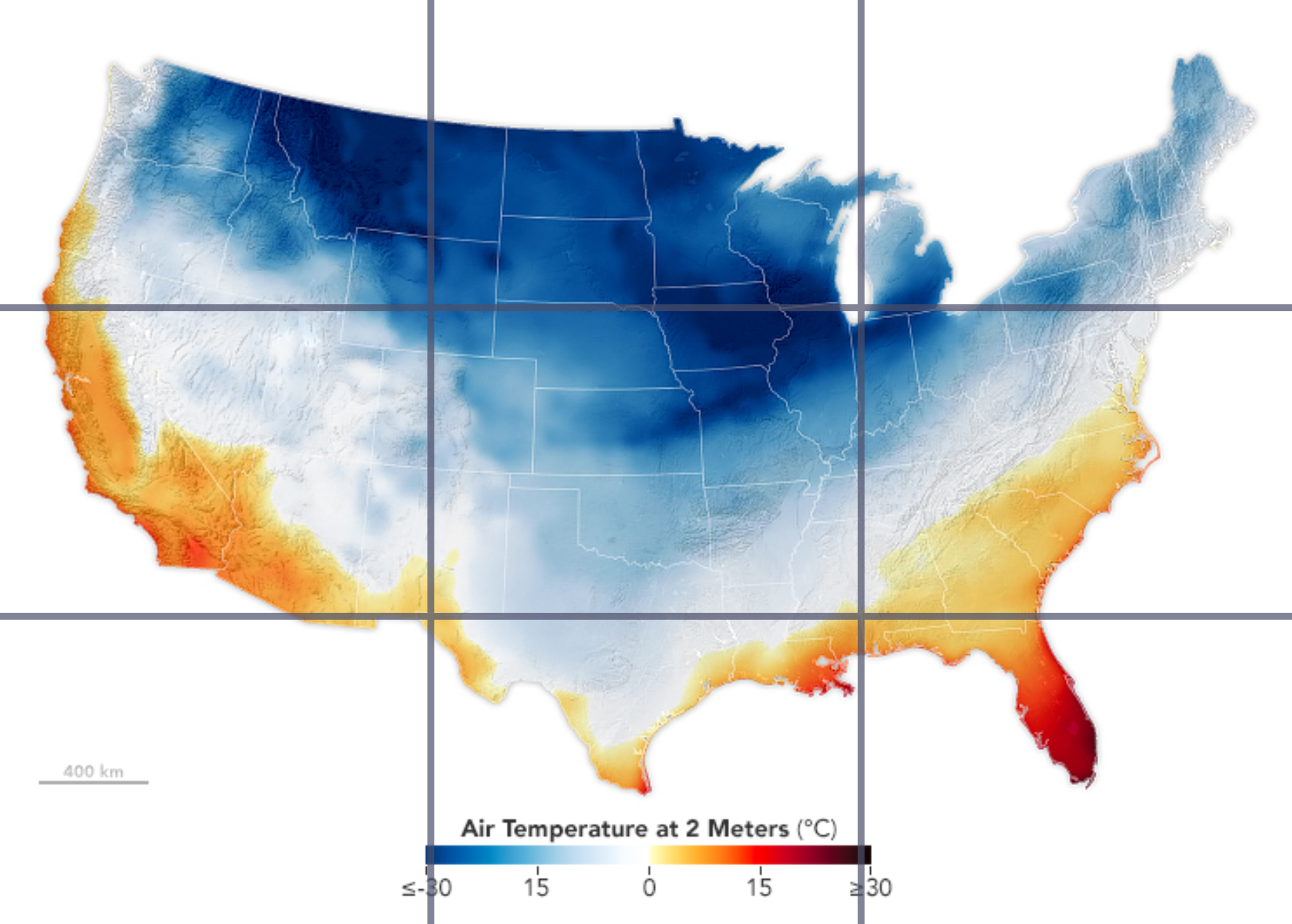
Example of rule of third in map. Using tool.
Common Ratio
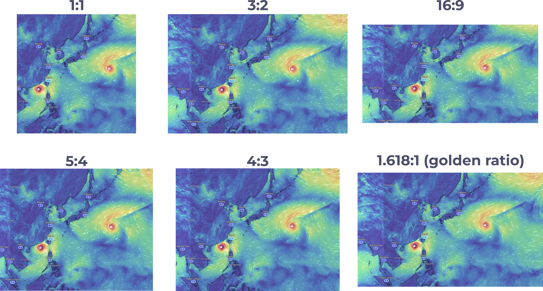
Landscape.
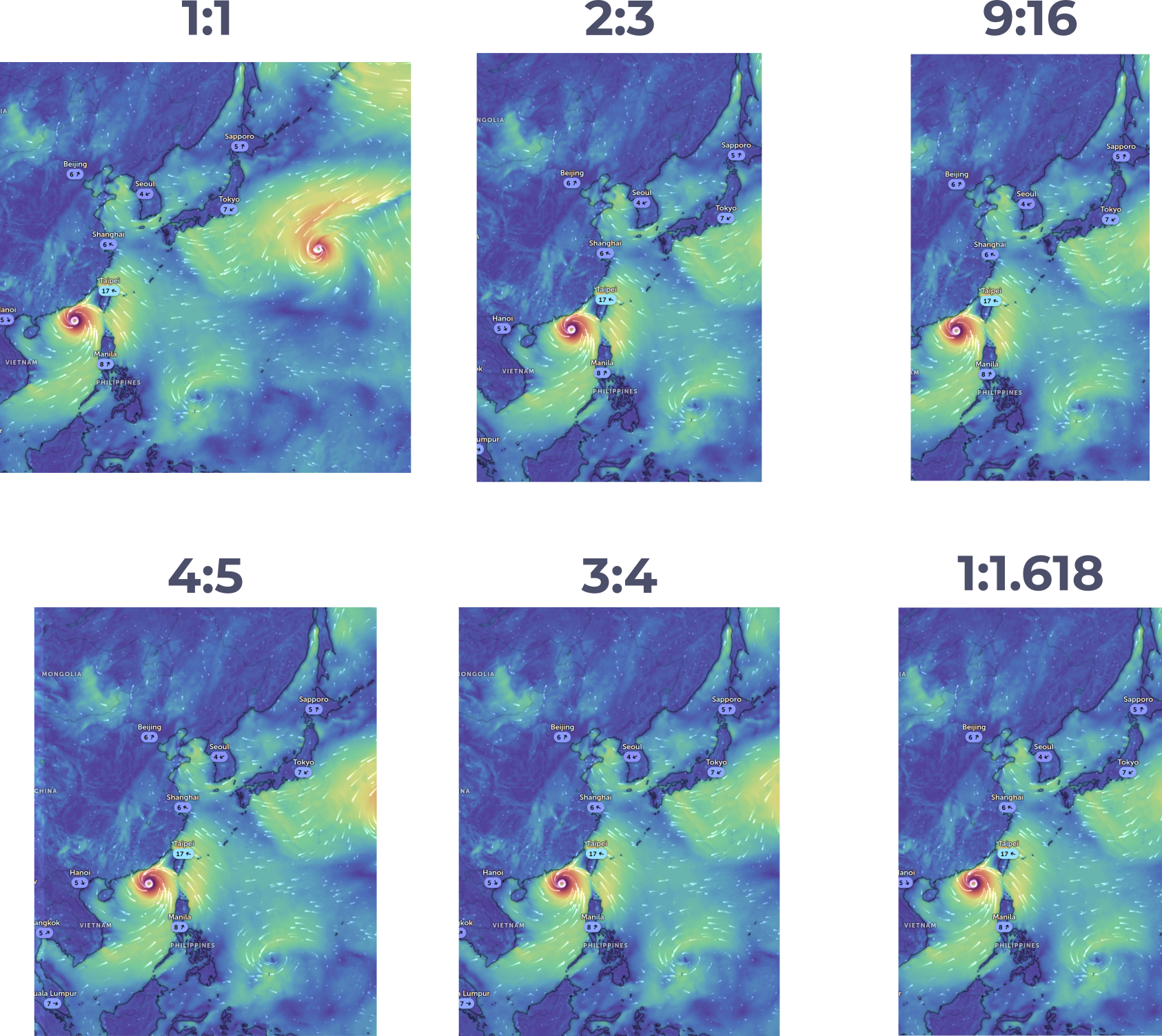
Portrait.
Spacing -

Spacing in design. [Source](https://

Spacing Definition. [Source](https://
White spacing in Google
Spacing - For Balance
Spacing for balance in a map. Source

Example of spacing. Source
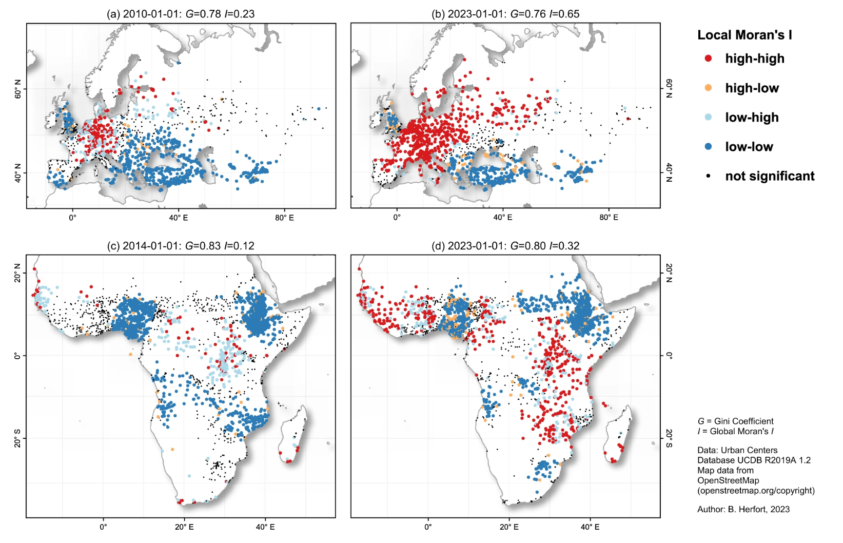
Example of spacing. A spatio-temporal analysis investigating completeness and inequalities of global urban building data in OpenStreetMap)
- Wesson, C. (2017). Layout, balance, and visual hierarchy in map design. In The Routledge Handbook of Mapping and Cartography (pp. 311–323). Routledge. 10.4324/9781315736822-28