Data Visualization Tools
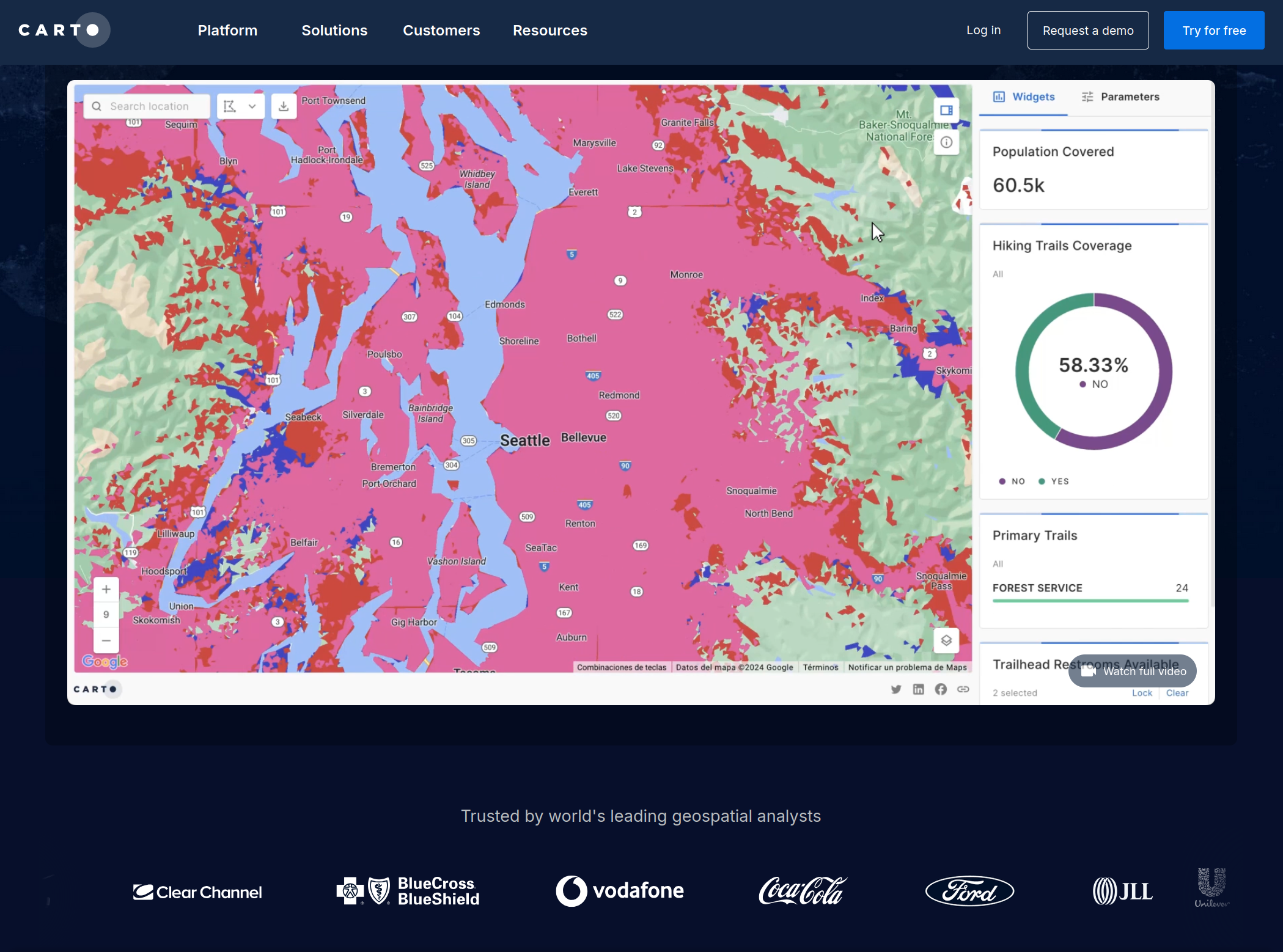
Carto: A location intelligence and data visualization platform for creating interactive maps and geospatial applications.
Tableau: A data visualization and storytelling tool that allows you to create interactive and engaging visualizations.
Power BI: A business analytics platform from Microsoft for creating data visualizations, reports, and interactive dashboards.
QGIS: A free and open-source GIS software that enables geospatial data visualization and analysis.
ArcGIS Online: A web-based GIS platform by Esri that enables users to create, share, and analyze geospatial data, maps, and apps.
Mapbox: A platform that offers customizable map designs tools to create interactive maps and location-based applications.
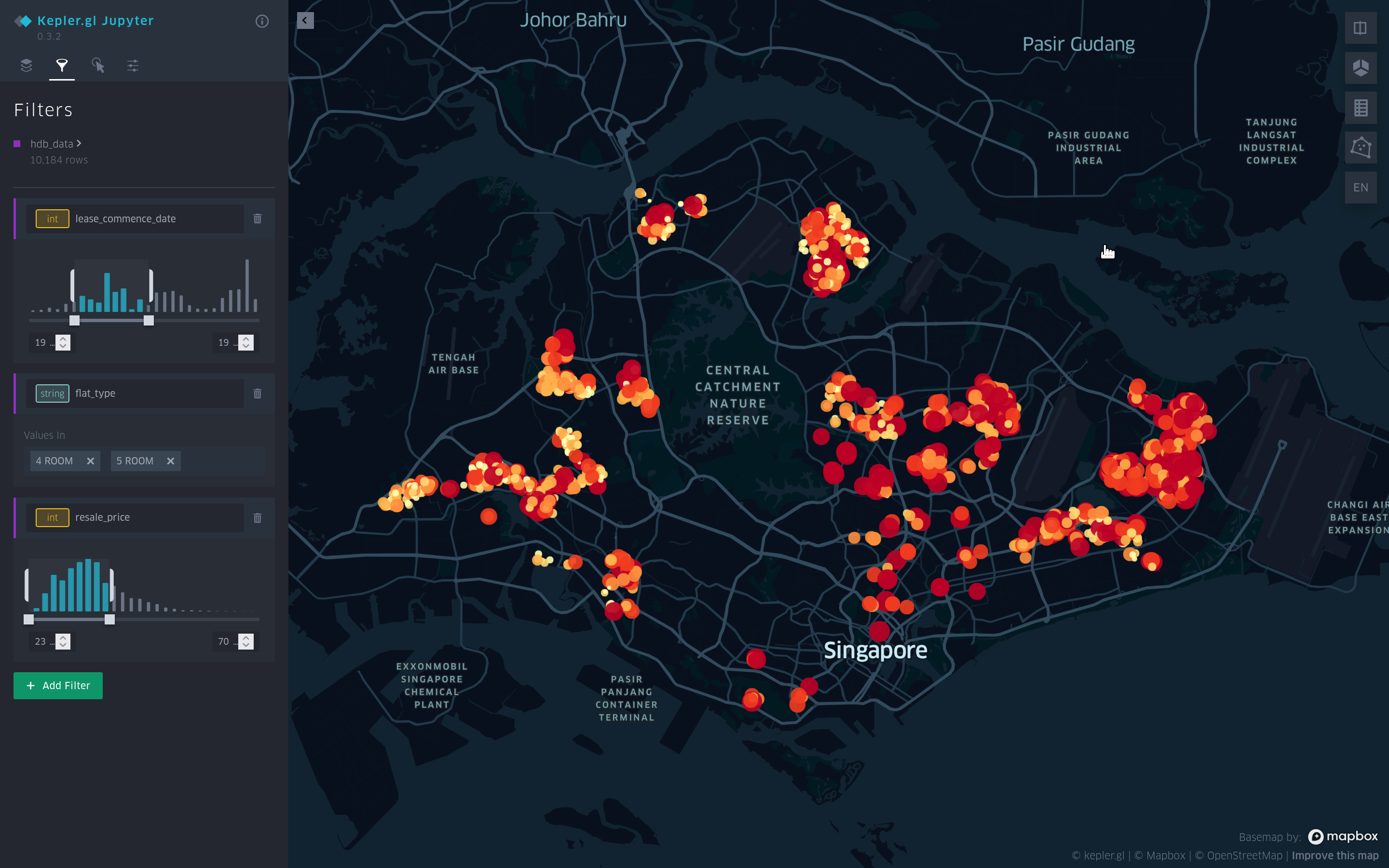
Kepler.gl: A geospatial data visualization tool that allows users to create large-scale visualizations for geospatial data exploration.
Flowmap.gl: A web-based tool designed for visualizing and exploring spatial interactions using animated flow maps.
Plotly: A versatile data library that can be used with various programming languages, offering a wide range of interactive charts, maps, and plots.
Bokeh: An interactive data visualization library for Python, providing elegant, concise construction of versatile graphics and interactive plots.
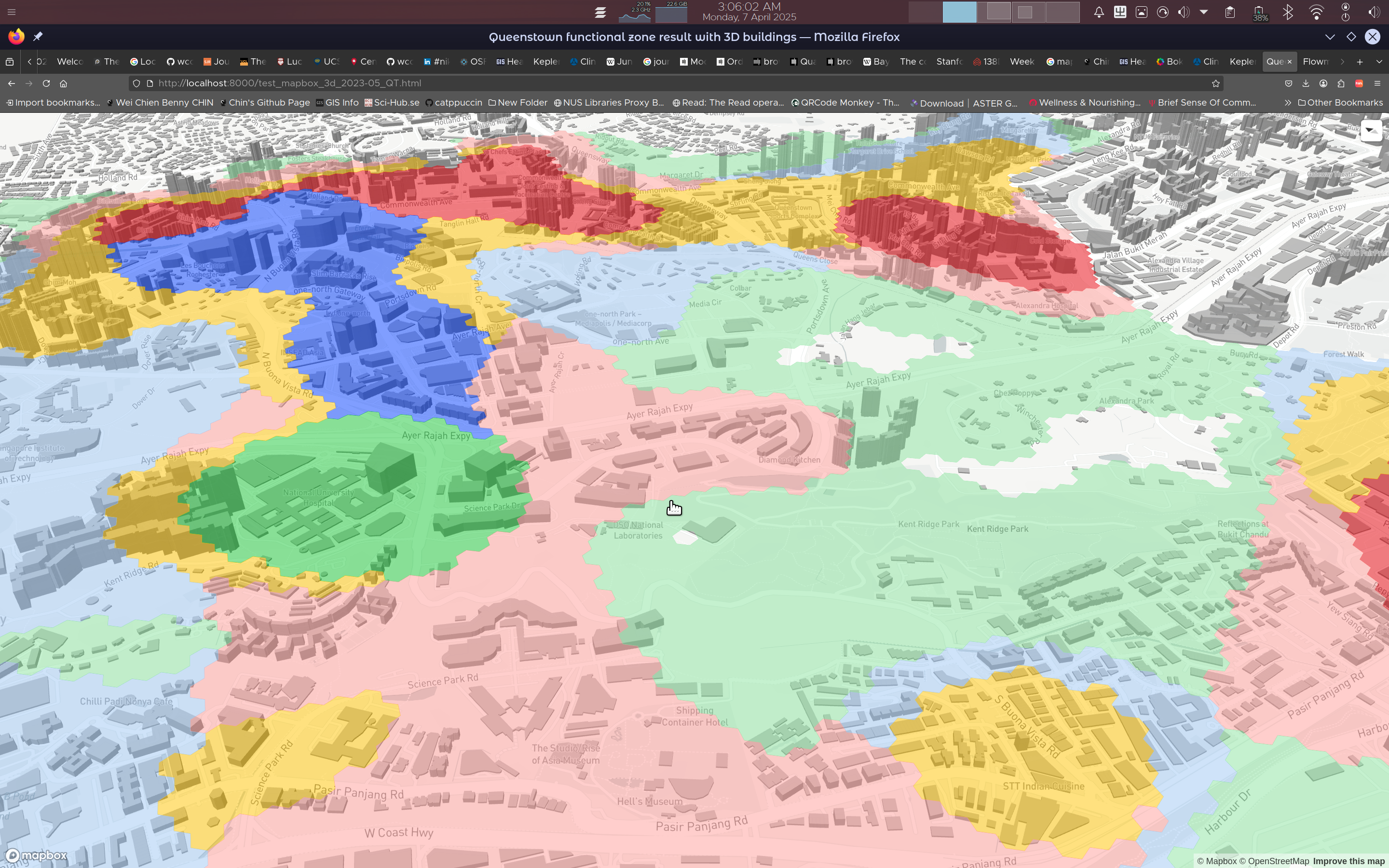
Mapbox 3D buildings. Mapbox
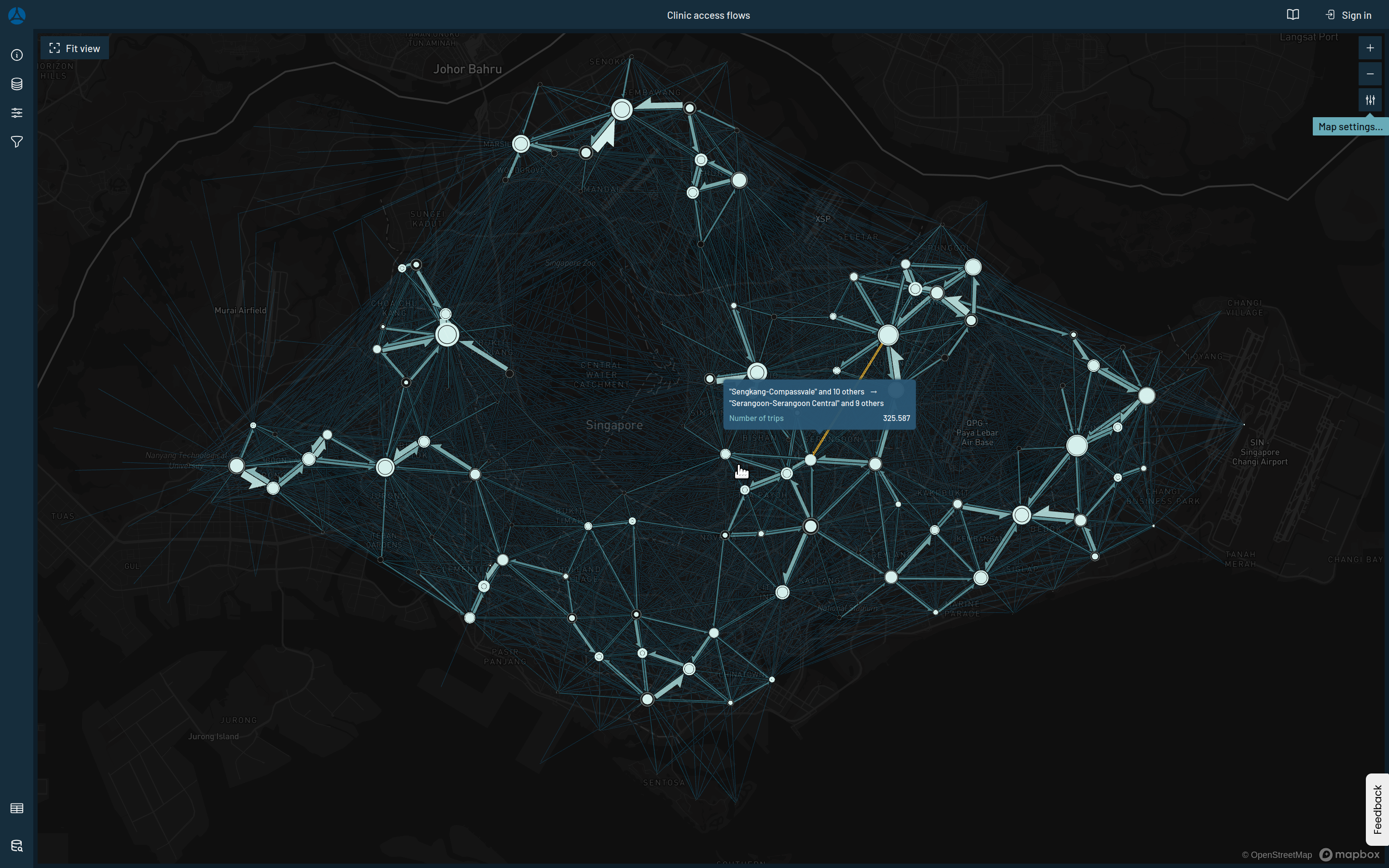
Flowmap.gl demo. Demo link
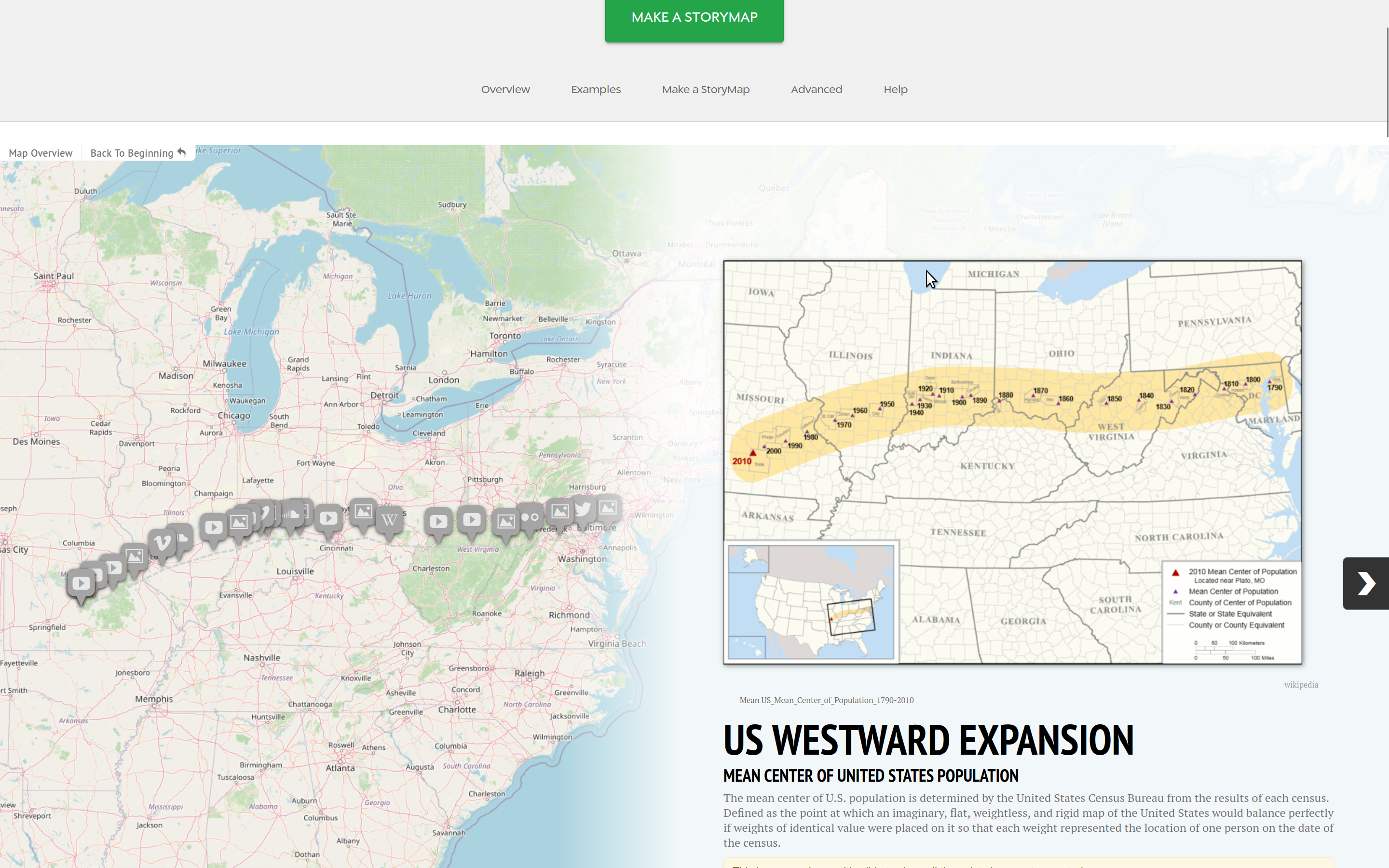
Storymap.js (Knight-lab) webpage
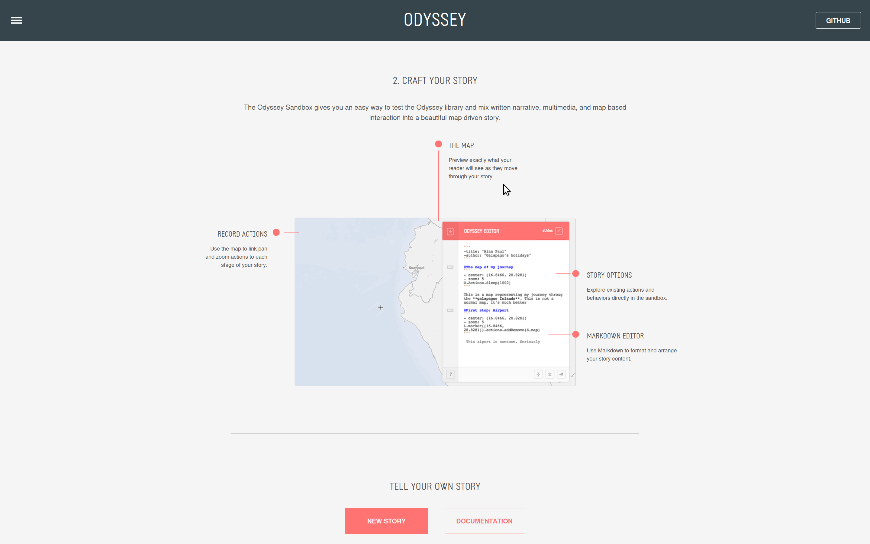
Odyssey.js (by Cartodb) webpage
Programming Languages and Libraries
Python: A popular programming language with libraries for data analysis, visualization, and mapping, such as:
Matplotlib,
Seaborn,
Bokeh, and
Folium.
R: A programming language designed for statistical computing and visualization, with packages like:
ggplot2 and
leaflet.
JavaScript: A versatile programming language for building interactive web-based visualizations, with libraries such as:
D3.js and
Leaflet.js.
Storytelling Resources
“Storytelling with Data” (NUS Library link) by Cole Nussbaumer Knaflic: A book that provides practical tips and techniques for creating effective data stories.
The Pudding: A digital publication that uses data visualization and storytelling to explore a wide range of topics.
The Data Visualisation Catalogue: A comprehensive online resource showcasing various data visualization examples and use cases, offering guidance and inspiration for creating effective visualizations across diverse industries and applications.